〇 Brand Identity
〇 Design Direction
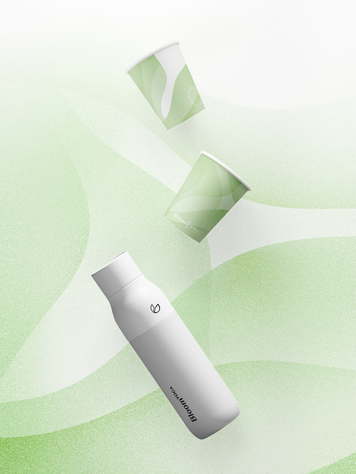
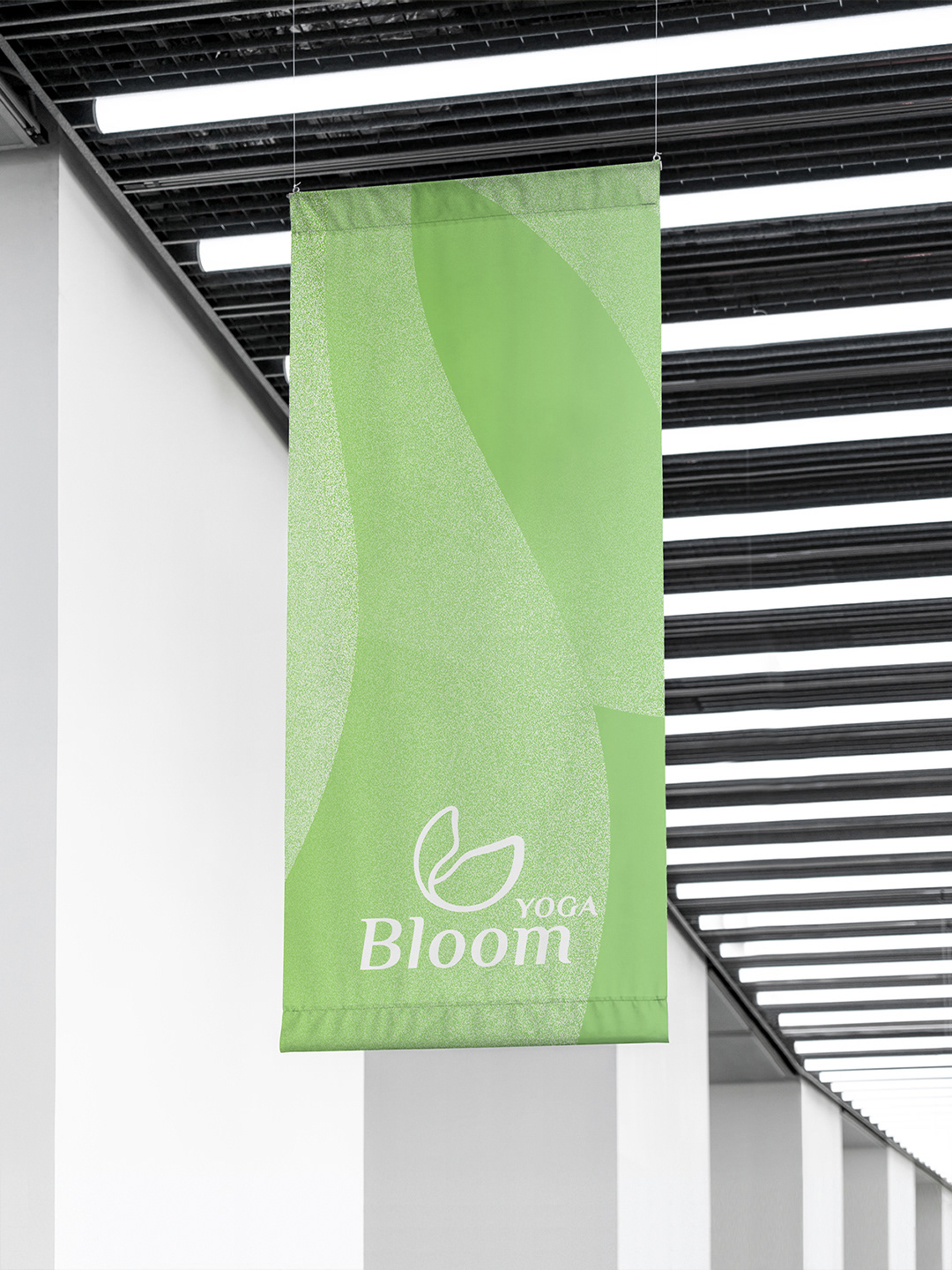
〇 Brand Collaterals & Merchandise
Bloom Yoga is a sport and lifestyle space founded by certificated trainer Nissan Xu, located in one of the CBD areas in Guangzhou, China. Targeting the mid-to-high-end market, it offers a professional yoga and pilates space with comfort for busy urbanites.
The branding process was carried out simultaneously with the interior design and renovation process, which requires designers with different expertise to communicate for a consistent result. It started from target customer research to selected brand materials design. The goal is to explore its core vision and value and build a distinctive visual identity differentiated from the trending spots of a similar kind.
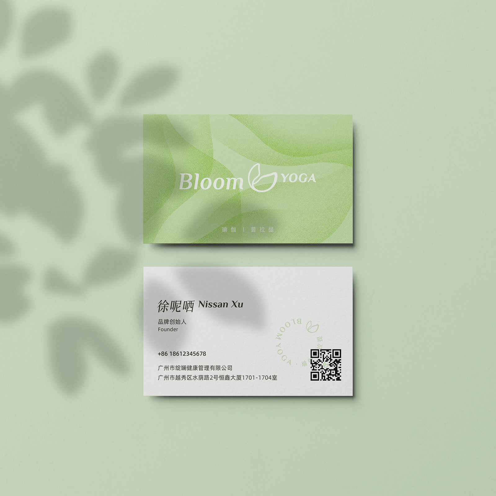
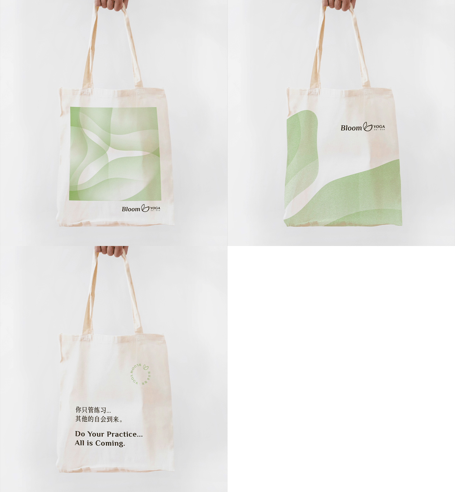
Working closely alongside the team to ensure a thoughtful meshing of the interior and identity concepts, we created a pattern referencing the tiling within the space, brought to life by the characteristic dual line weights within the logotype.
Bloom Yoga has officially announced its opening in October 2021.
Yoga is not only a sport, according to Nissan - it is a practice that connects nature, the outer body, and the inner soul and makes people soft and firm. With this essential vision and location analysis - a space in an office building with a residential area nearby, I guided Nissan to clarify the target groups of Bloom Yoga as follows:
〇 Teams and individuals working nearby seeking spare activities;
〇 Homemakers and freelance workers in need of social connections;
〇 Mature ladies (age 40+) chasing balance of health and self-cultivation.
By profiling and storyboarding typical customers, we positioned Bloom Yoga as where people take a fresh breath in their busy lives and focus on their bodies and souls.
The logo concepts follow the visual direction phase. The mark selected has an organic looking with inconsistent strokes and slightly tilted. Nissan found it more related to the brand's name and looked more lively.
