〇 Visual Identity
〇 Packaging
The Mochi Collective (The Mochi Co.) is an artisanal dessert brand founded and run by Jacqueline Chan-Dentoni in Utrecht, the Netherlands. The Mochi Co. had been developed mainly in Utrecht area before 2020.
As same as other small businesses, the internet is taken as the mainstream channel for spreading its name. For further growth, Jacquline planned to expand her business into online retail market, which requires a renewal of the brand's visual system including logo, packaging and supporting graphics design for both online and offline using.
The request at first was to design a customised packaging design that was visually attractive and functionally suitable for storage and transporting. Looking into the existing logo, visual elements and understanding the developing strategy, we discussed and agreed on the solution of renovating the brand visually with a distinct, consistent identity system, from which we will design a package for universal use.
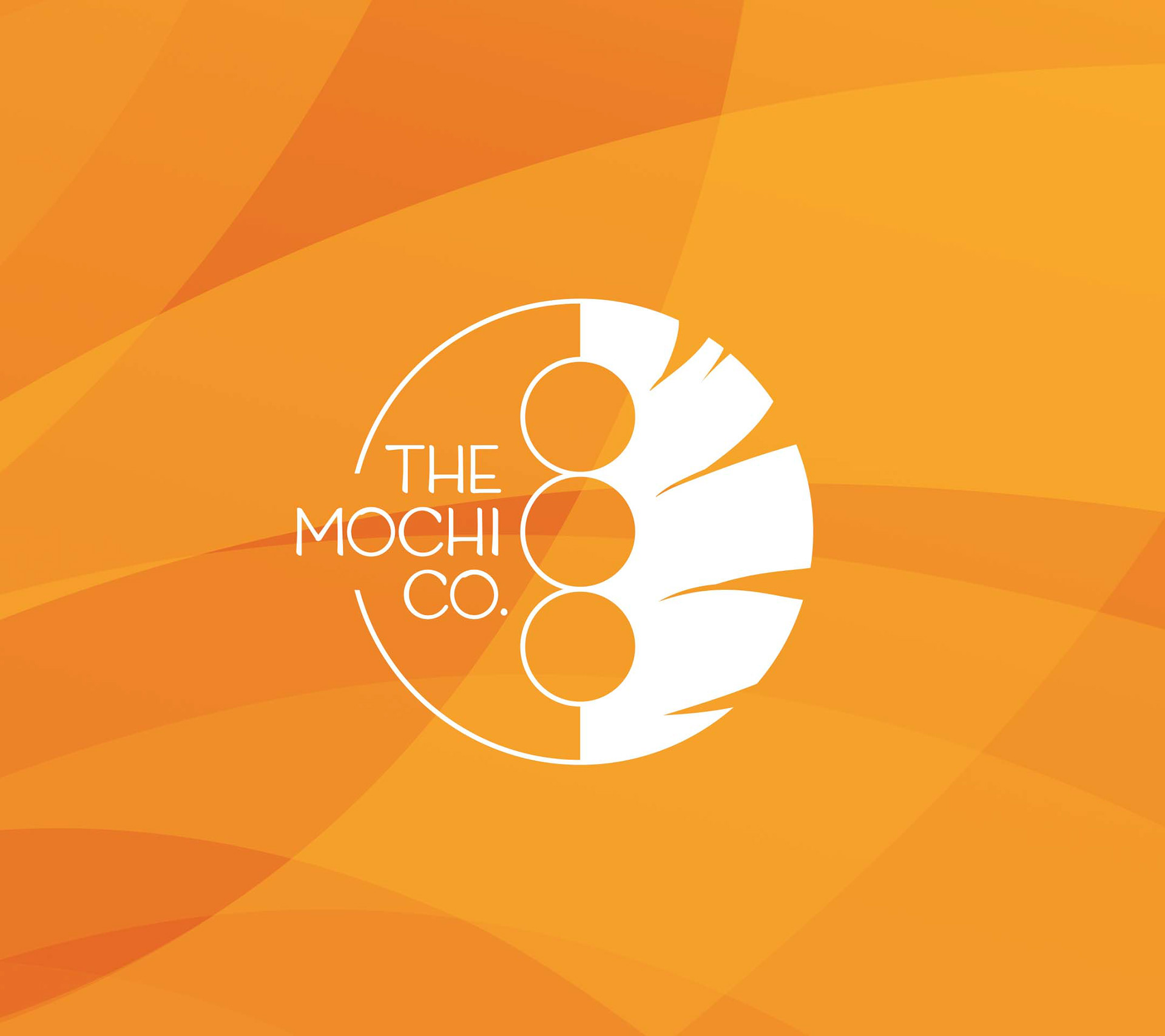
As a half easterner and half westerner specialised in making desserts with eastern crafts and western ingredients in Hawaiian style, Jacqueline's main request was to incorporate the core value of cross-culture in the logo design.
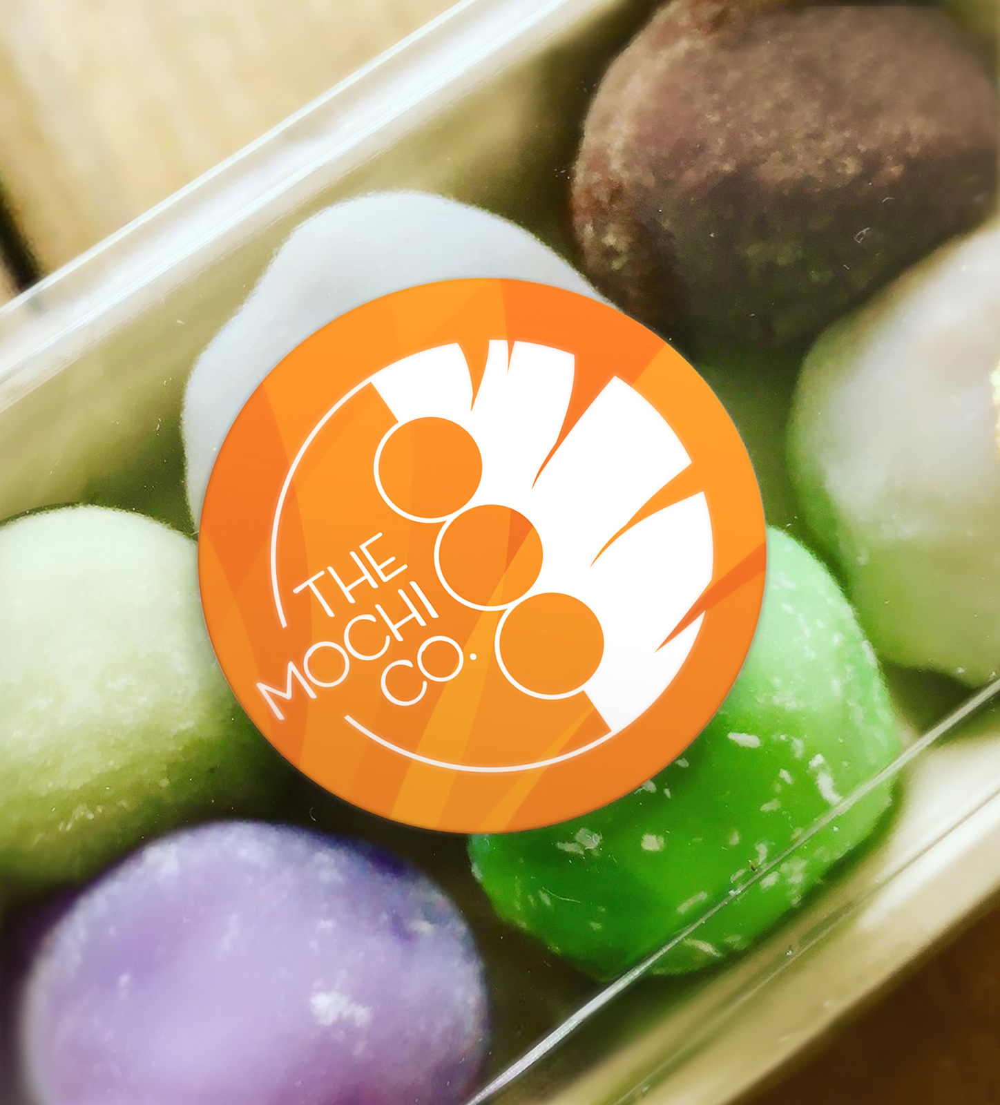
To inherit the gene from the original mark, the new mark remains a geometric shape of two semicircles. One of the semicircles is designed in minimalist style, and the other one has more organic and natural details of a banana leaf - an icon of Hawaii.
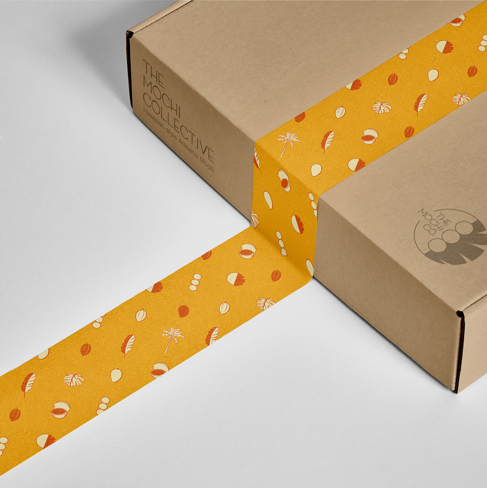
The package of Mochi has to be able to be frozen, sealed, folded/layered for storage and transportation, anti-moister, and environmental-friendly, with divider to avoid Mochi being collided with each other. We researched into the materials, structures, features and the market of food packaging. Taking the scale of business and accessibility of resources into account, we decided to use the drawer structure with an outer sleeve and a paired heat-sealed container with divider.
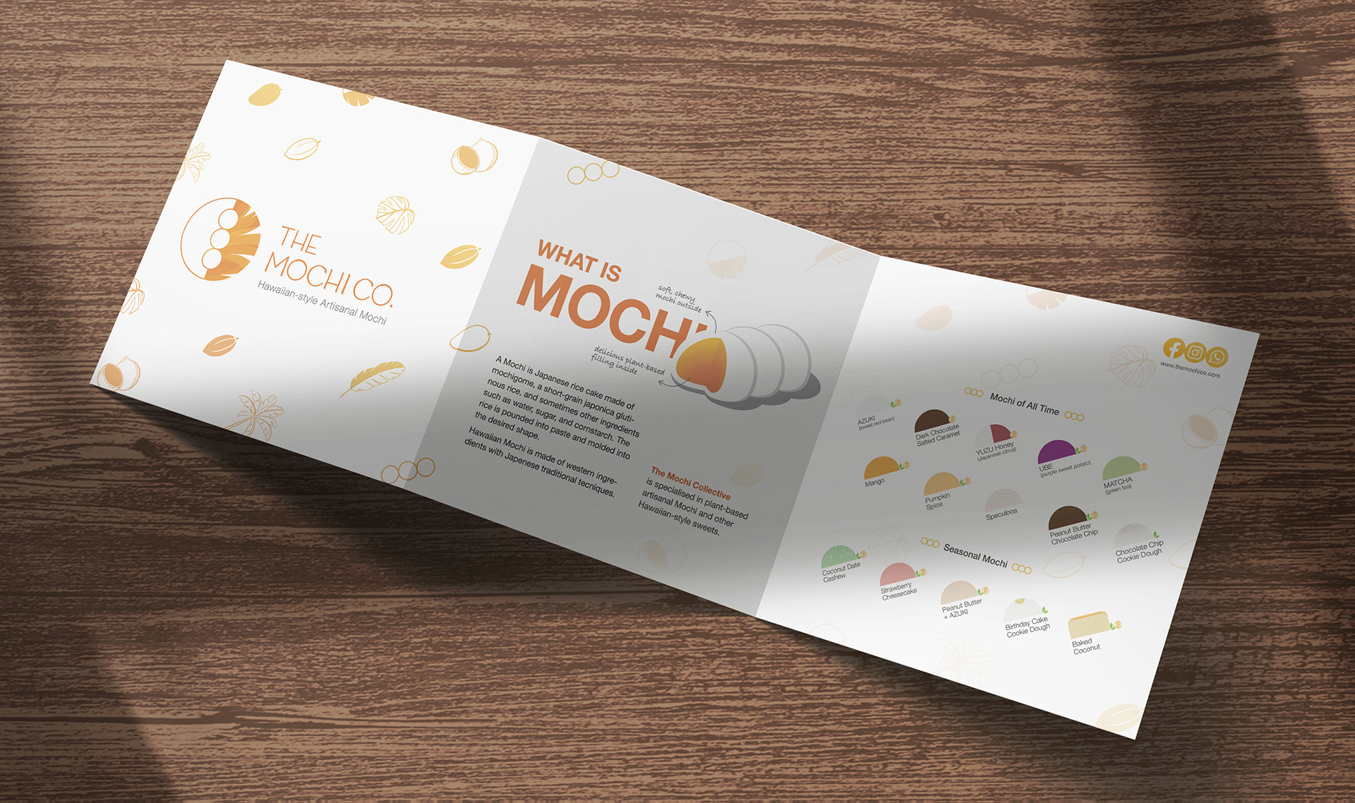
For the need of cost-controlled at this stage, the challenge is to design one packaging for all Mochi combinations than different ones for specific flavours, incorporate rich but well-cluttered information with flexibility and simplicity for Jacqueline to edit herself.
Logo Exploration


