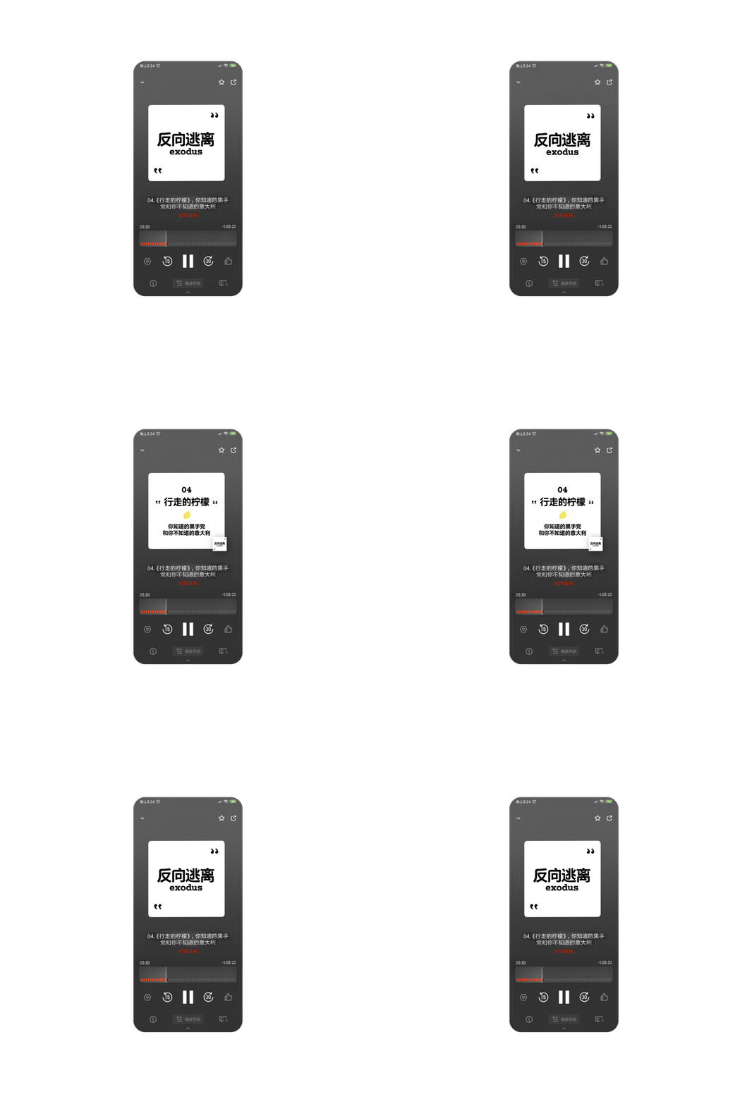
〇 Visual Identity
反向逃离 exodus (Chinese name means Reversely Escape) is a new podcast channel that shares insights on books, activities and society via conversations between two podcasters. It is a call for peaceful, logical perspectives towards the world, and an exploration of modern life attitude other than rat race or lying flat.
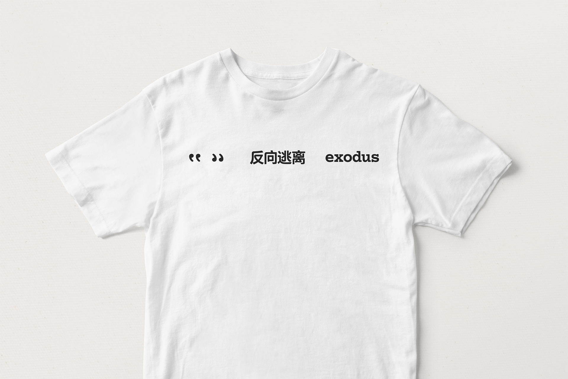
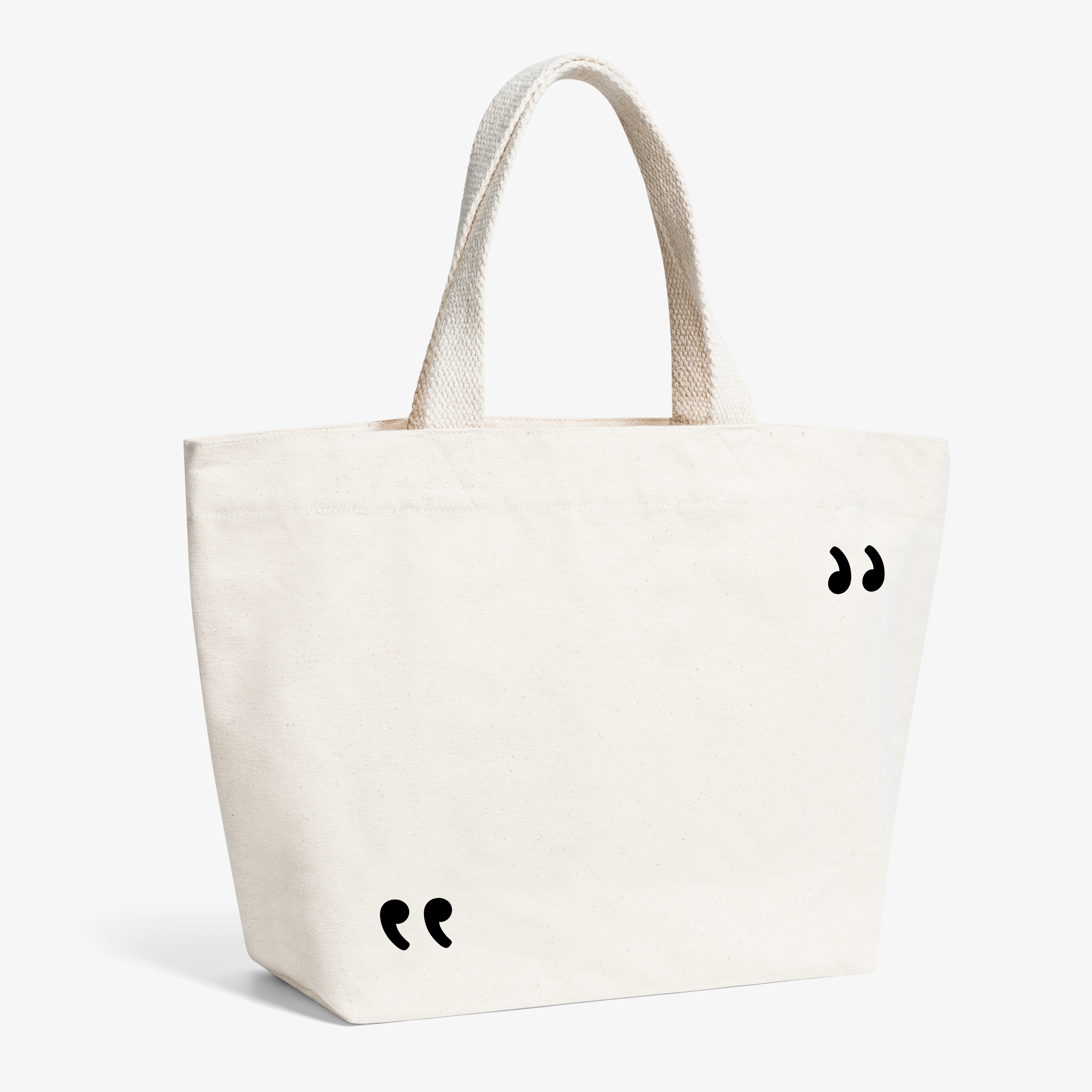
Voice tone is the most significant symbol of every podcast. Our brand identity design aimed at composing a concerto of visual and peaceful, calm and restrained audio experience to approach people that are mentally resonated. To express the core point of view - there is more than one answer to our life, we flipped and tweaked parts of the Chinese characters to make the logotype slightly strange and awkward in visuals, but not losing its legibility. The flipped quotation marks symbolising conversation act as brandmark and key visual element that plays around to fit in various layout.
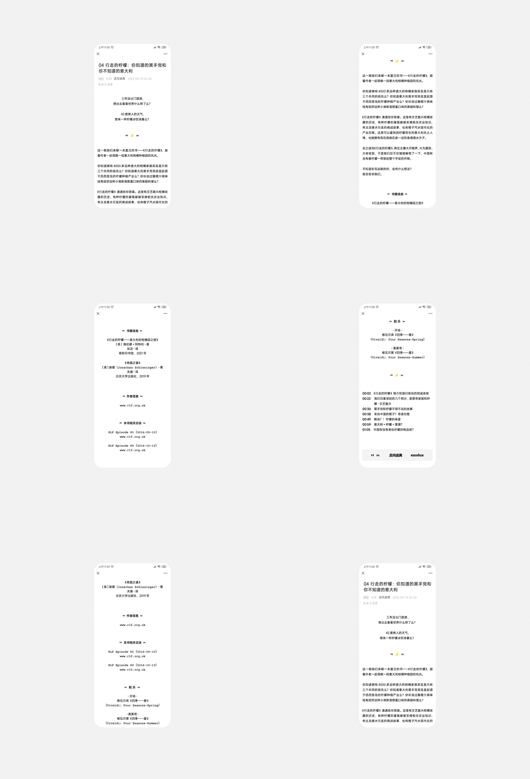
The typography and icon are designed so simple to be modified according to each episode, so the podcasters can effortlessly maintain the visual design themselves.
