〇 Brand Strategy
〇 Visual Identity
〇 Logo Motion
〇 Brand Collaterals
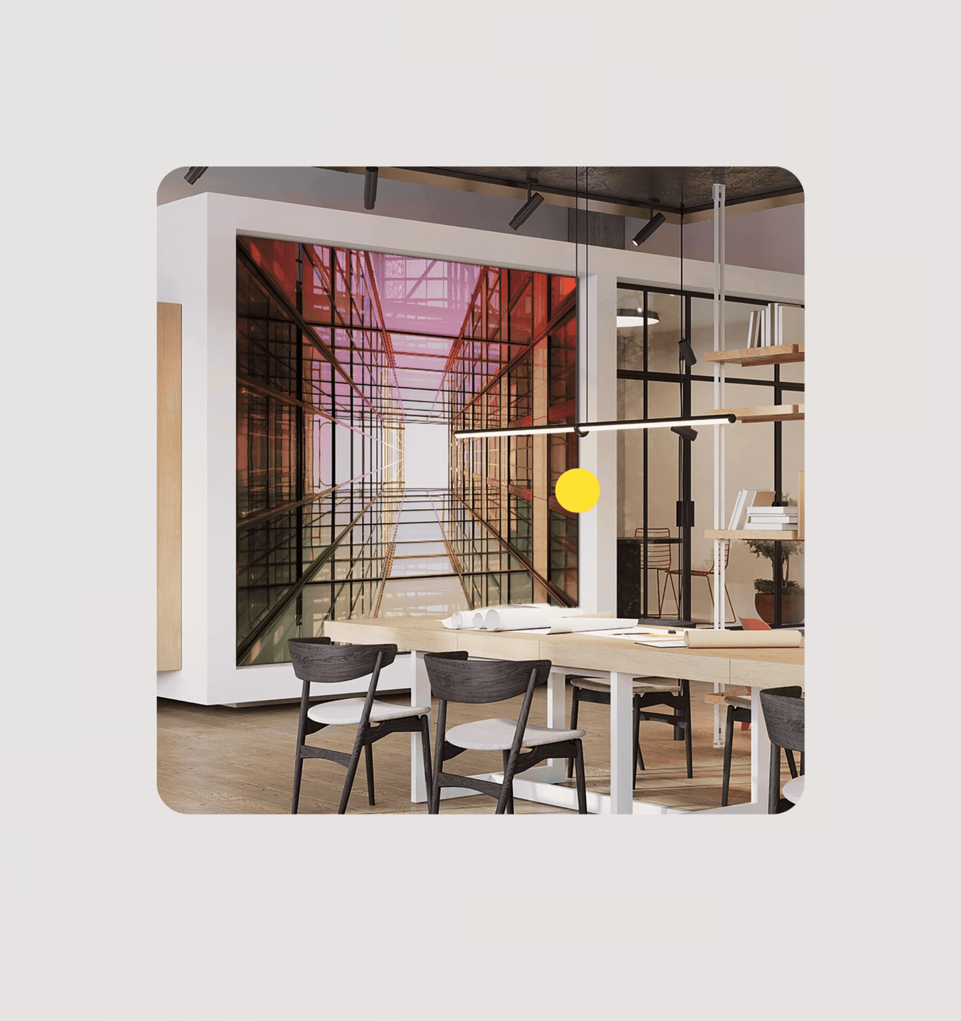
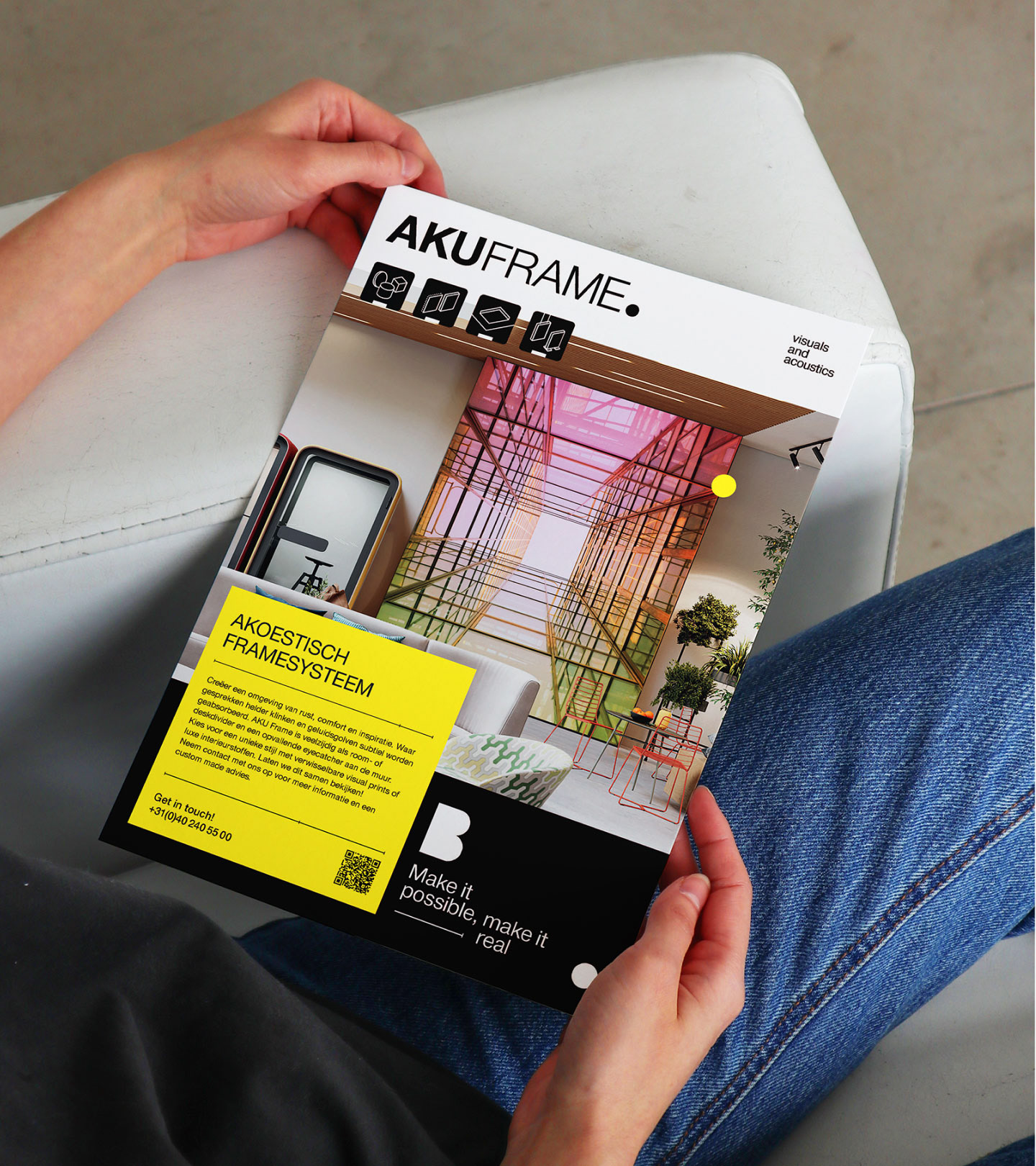
Braat Visual Creations provides building decorations for office buildings, exhibitions, hotels and other public places. With extensive knowledge and experience in production and installation, they have the confidence to bring clients' ideas to life and want their audience to perceive it through their visual identity.
In this project, we collaborated and delved deep into their business essence and unique value proposition to discover the most compelling expressions of their identity. The result is an enhanced visual identity where not only the basic elements were improved, but also a brand symbol that tells their distinctive quality, to the point, was created and became a powerful visual asset for the brand.
Project time: 08.2023

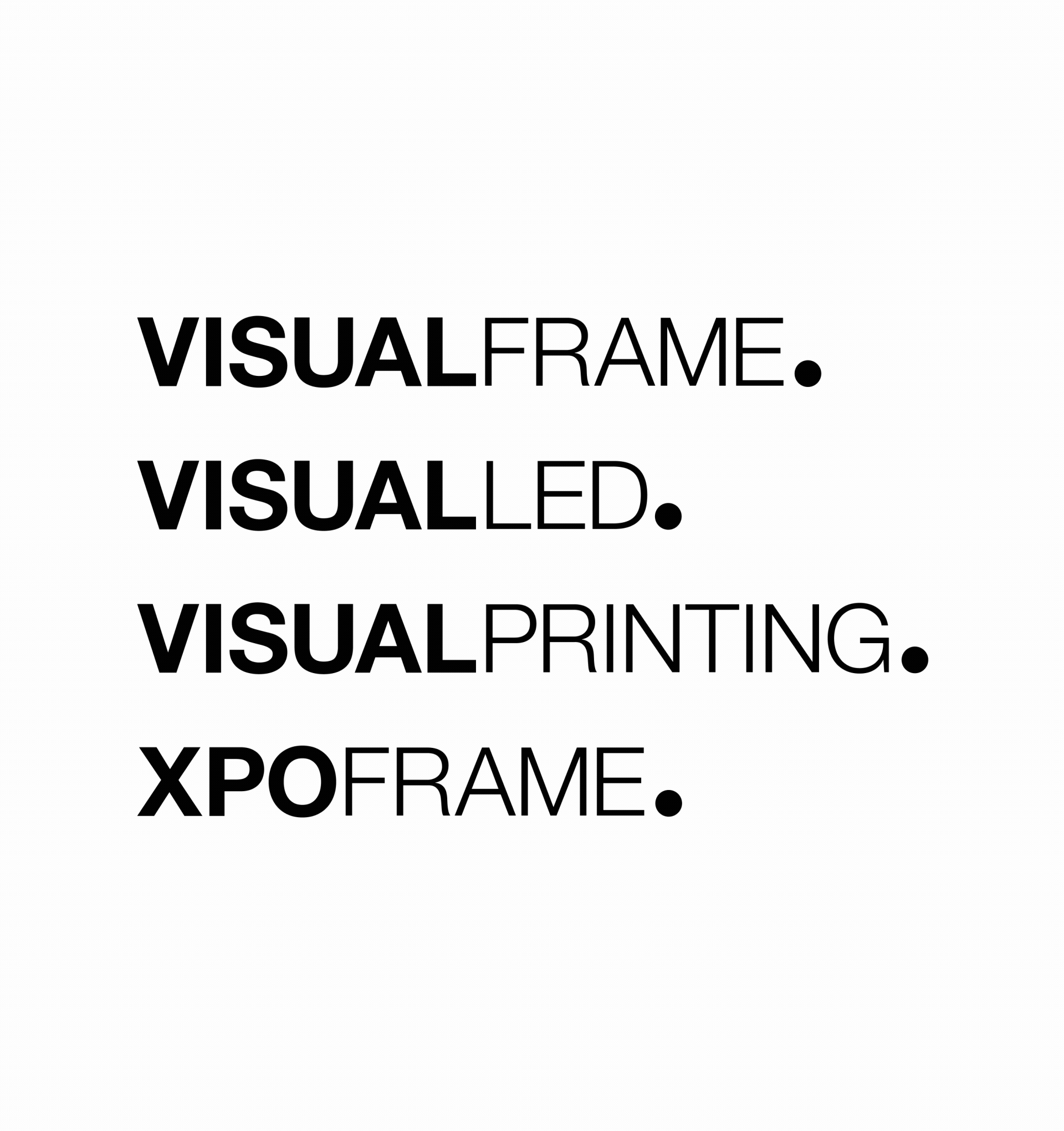
Wordmark and Symbol
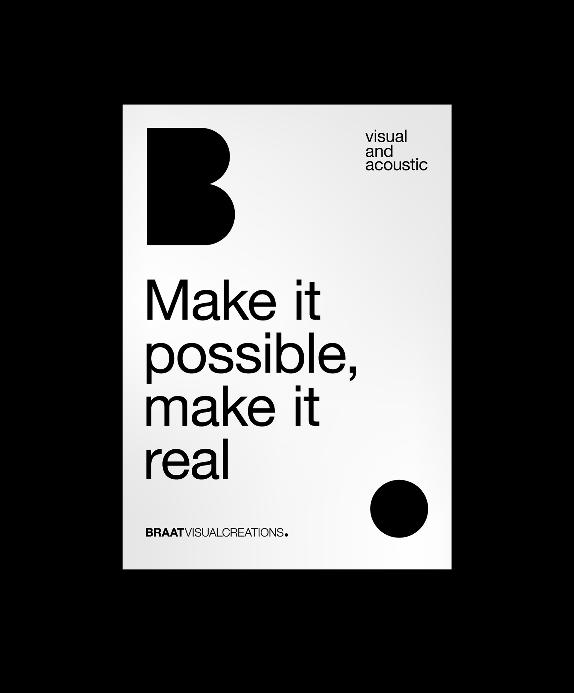
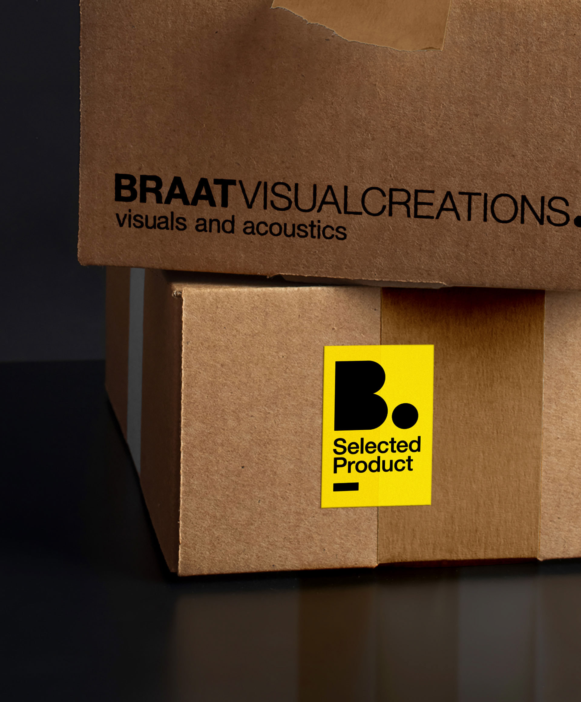
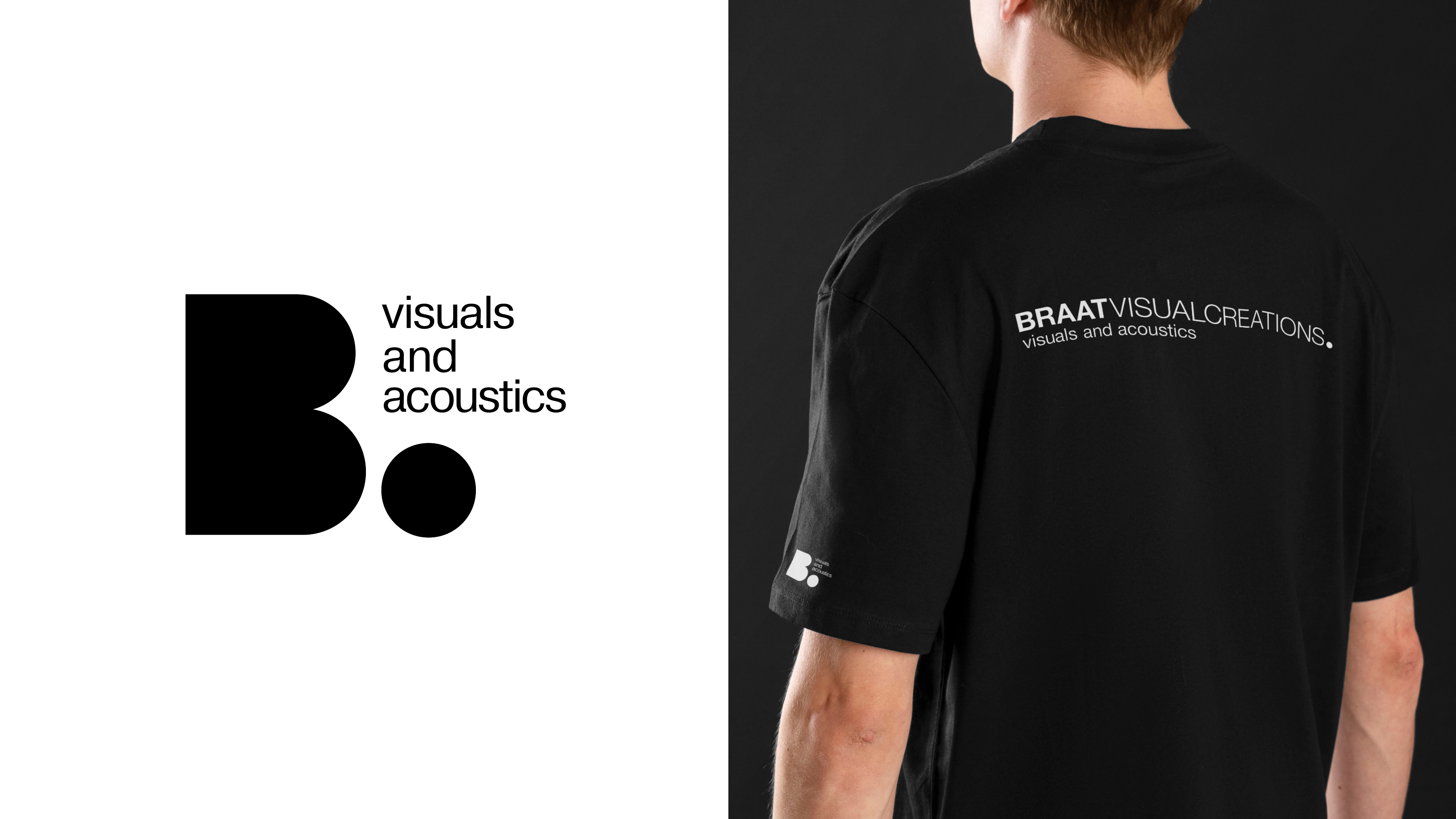
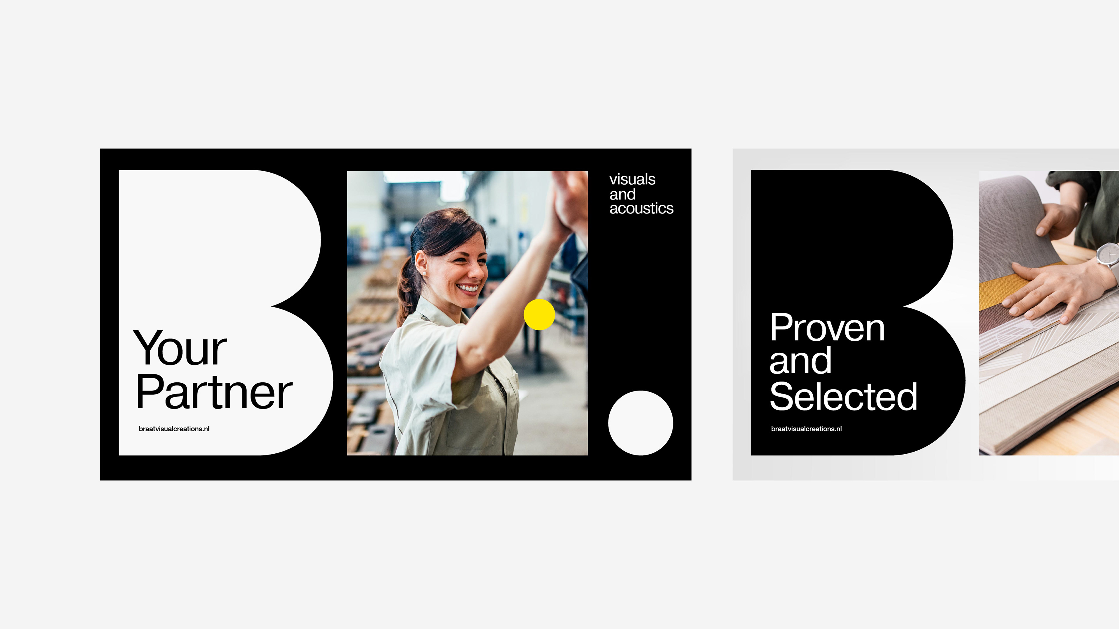
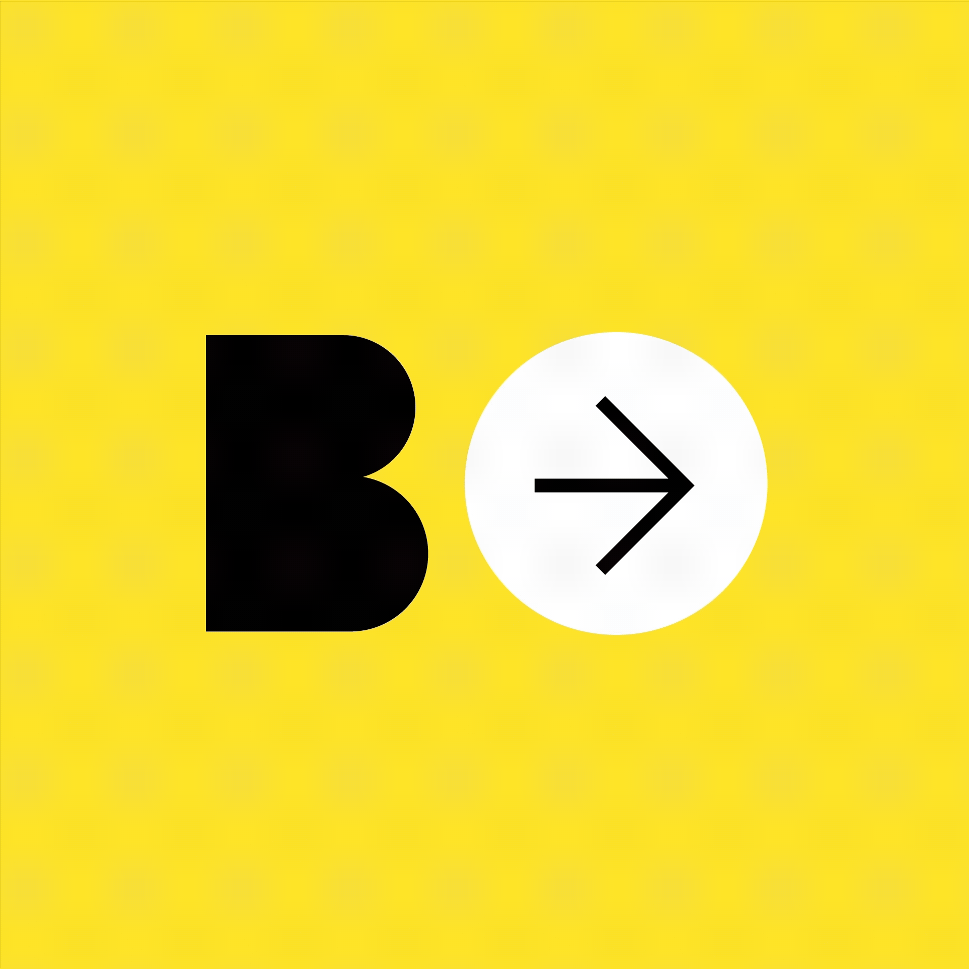
To communicate Braat Visual Creations’ core offerings more clearly, from the original wordmark, we extracted the letter B for Braat and a dot into a symbol that conveys the idea of “Braat is to the point.” This positioning directly expresses the brand’s core value: understanding clients’ needs precisely and delivering high-quality service, setting Braat apart in the market.
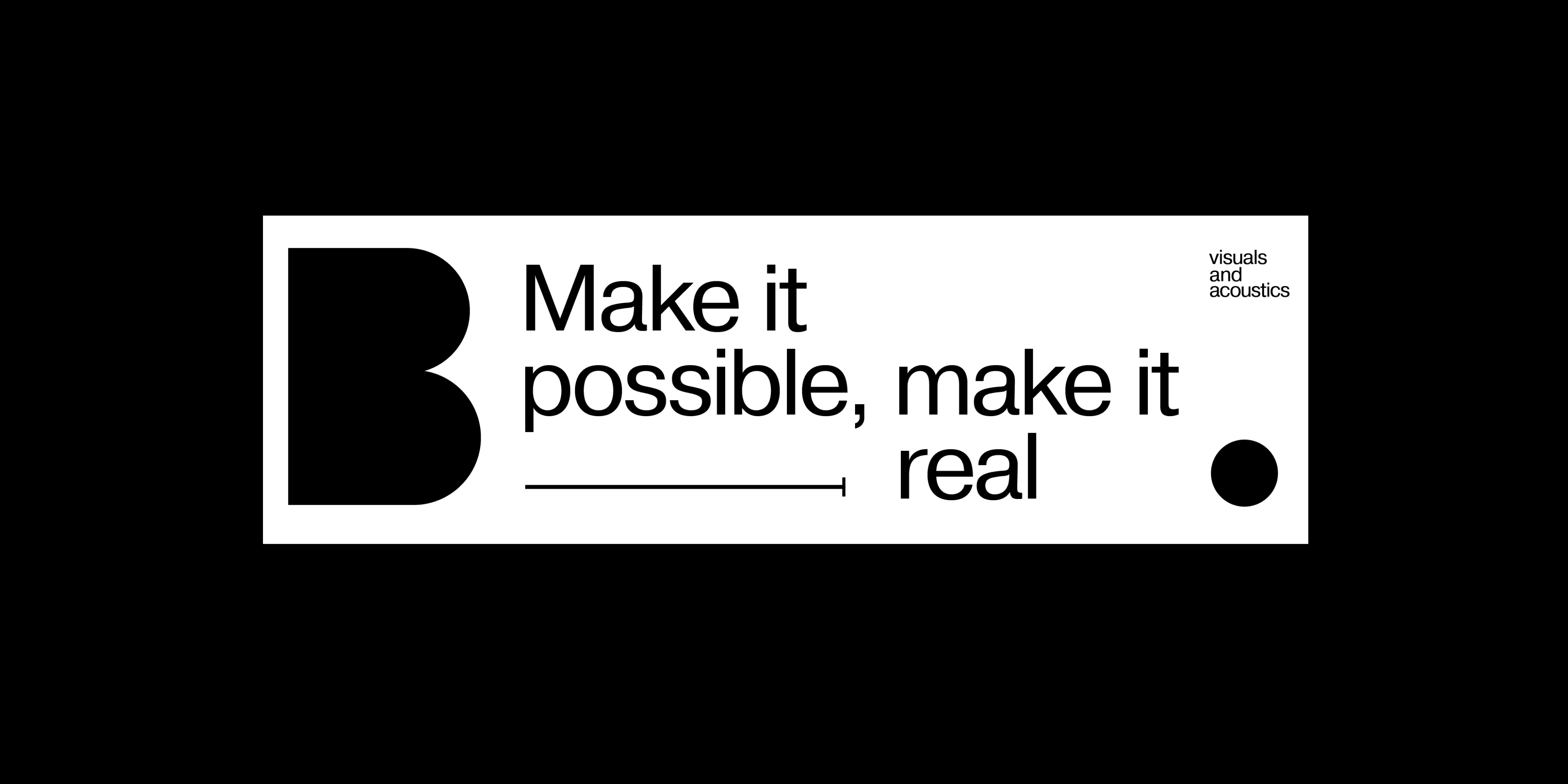
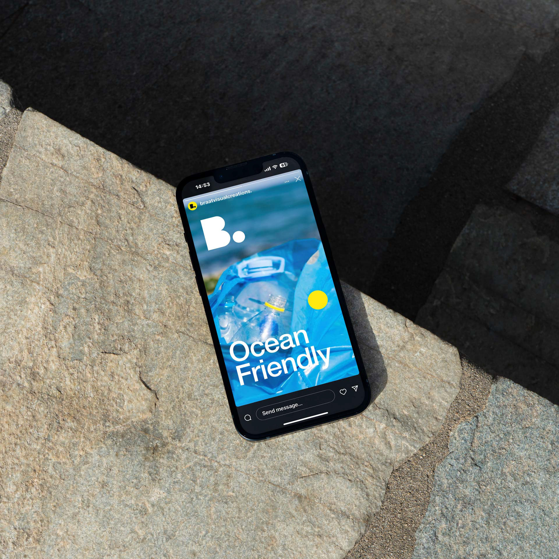
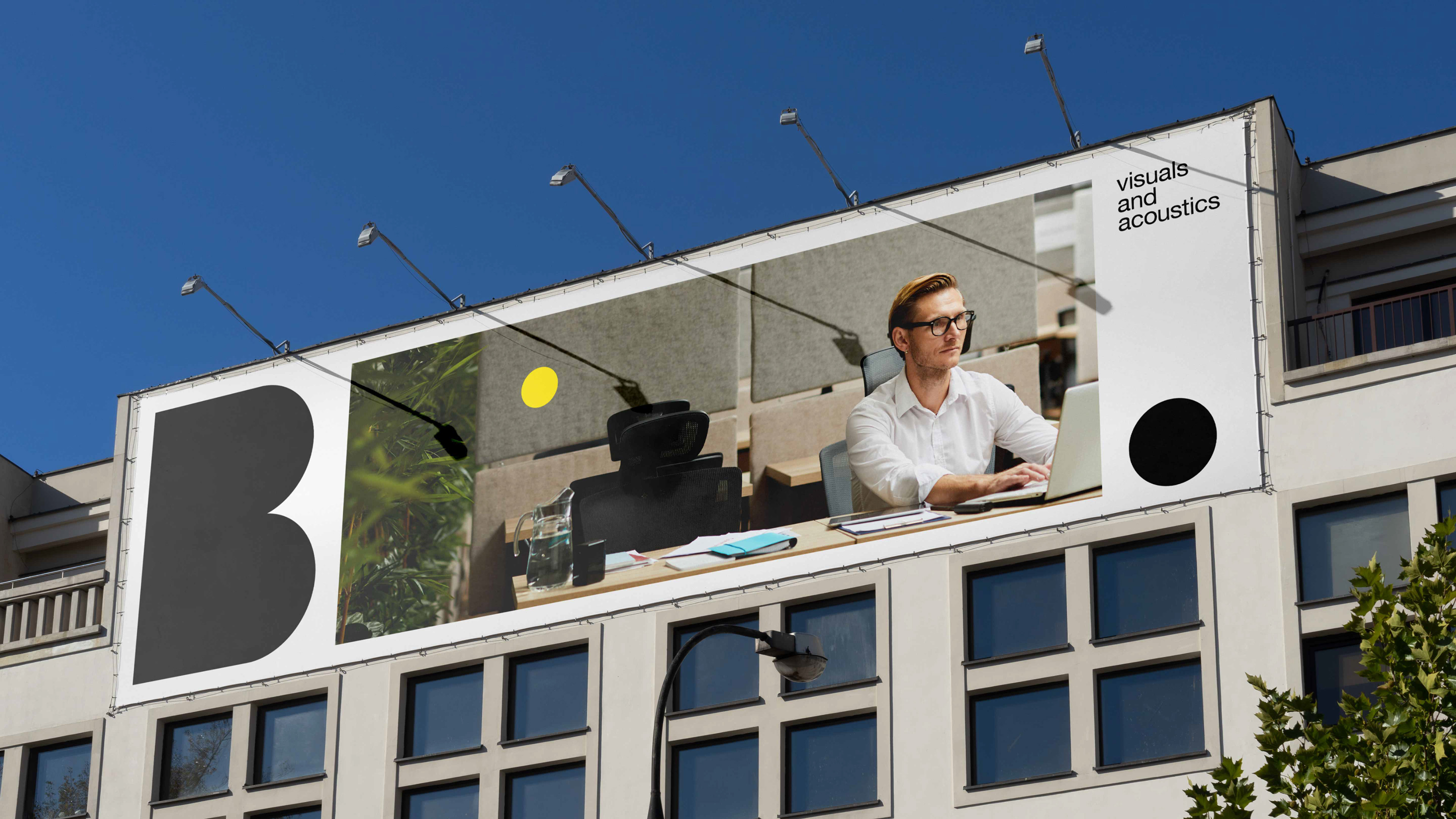
The symbol’s sleek, modern style visualises the powerful tone of Braat Visual Creations. With its flexibility of being deconstructed, it adapts to diverse layouts, integrates seamlessly with images and slogans, and can also be used narratively to tell the story of the company and its products.
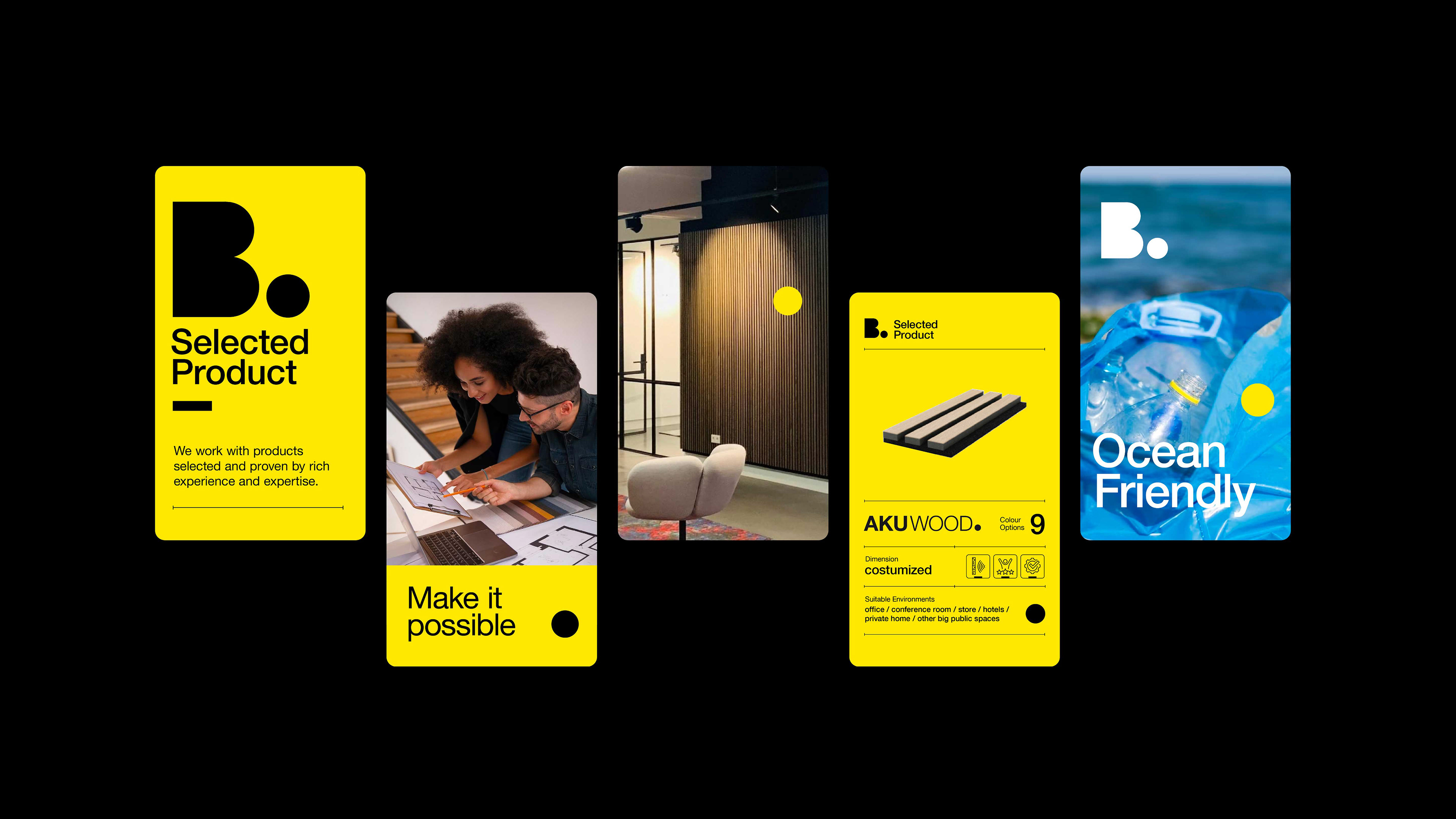
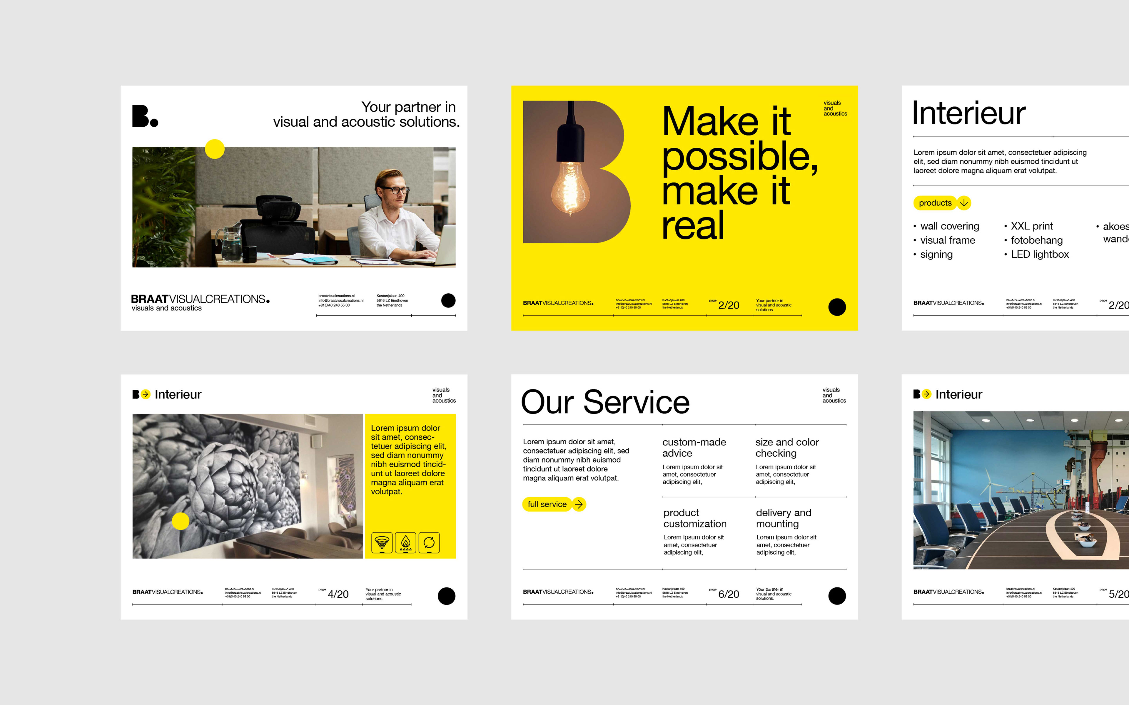
Visual System
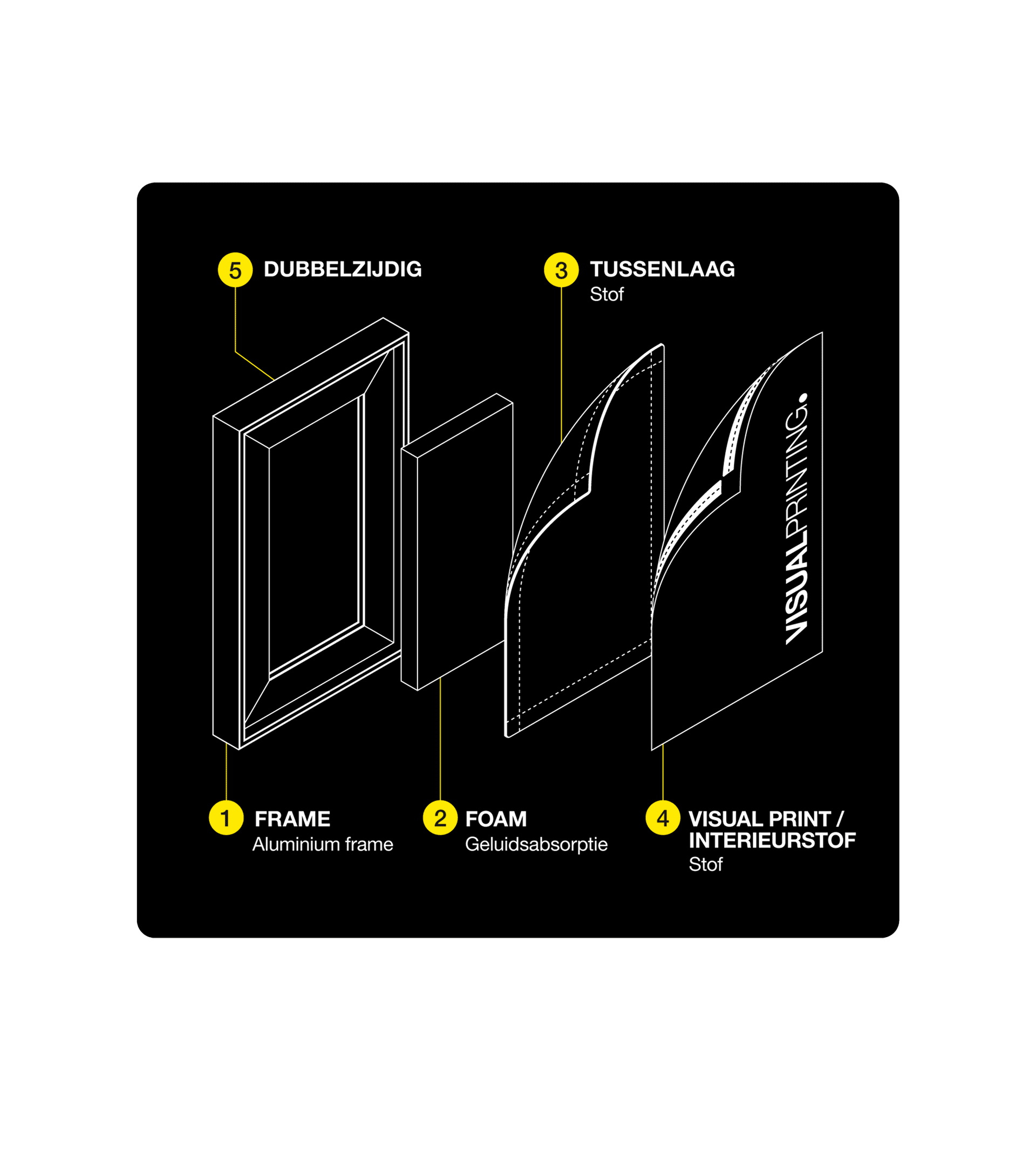
Building on the characteristics of the brand wordmark, we developed a unified label system for Braat Visual Creations’ different products and service lines. The dot, as a direct interpretation of “to the point,” is applied widely across the brand’s visual materials. In addition, a series of precise, engineering-inspired visual elements, icons, and technical drawings were created to showcase the products, collectively reinforcing the brand’s professional and knowledgeable impression.