〇 Brand Strategy
〇 Visual Identity
〇 Digital Design
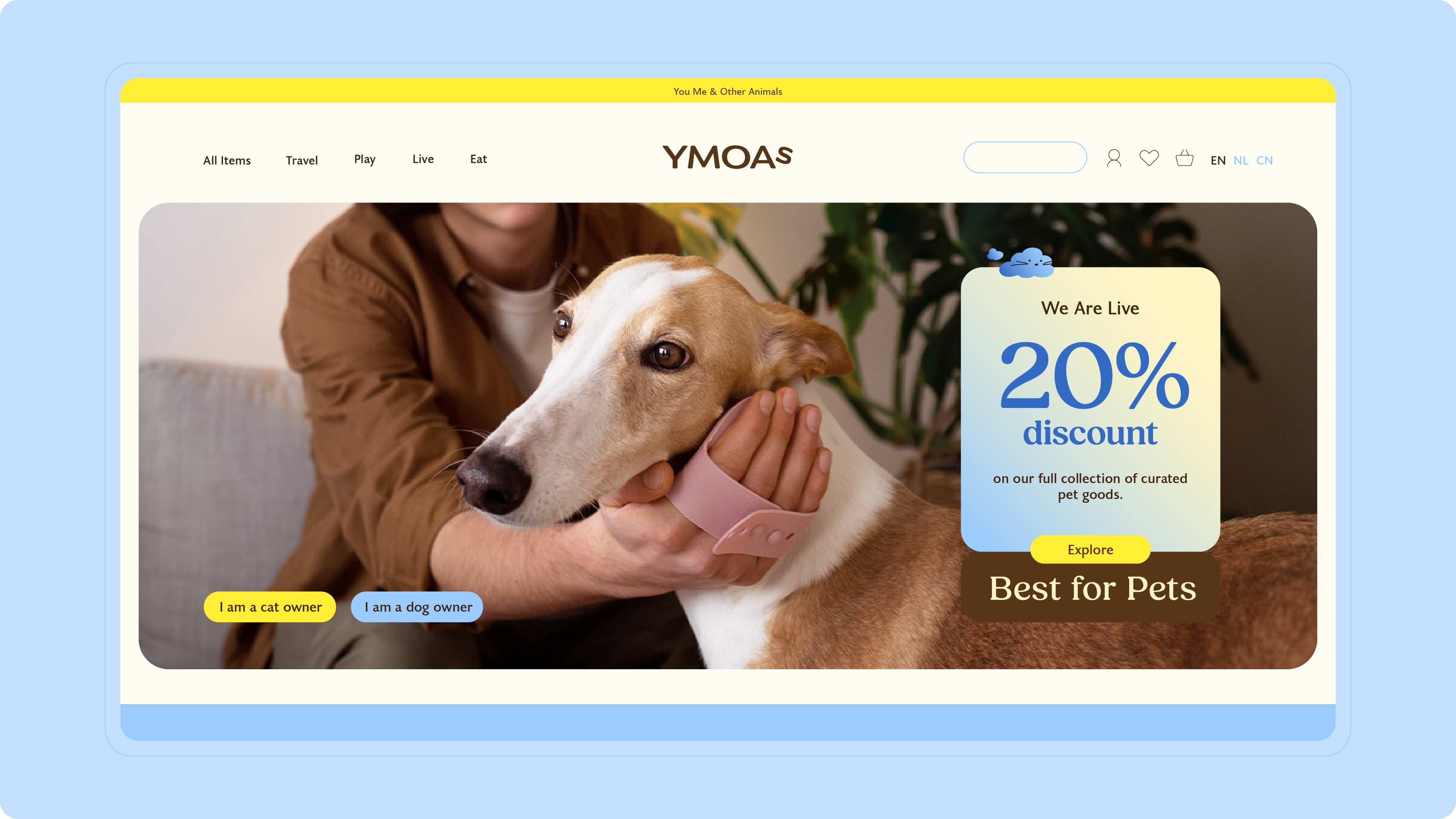
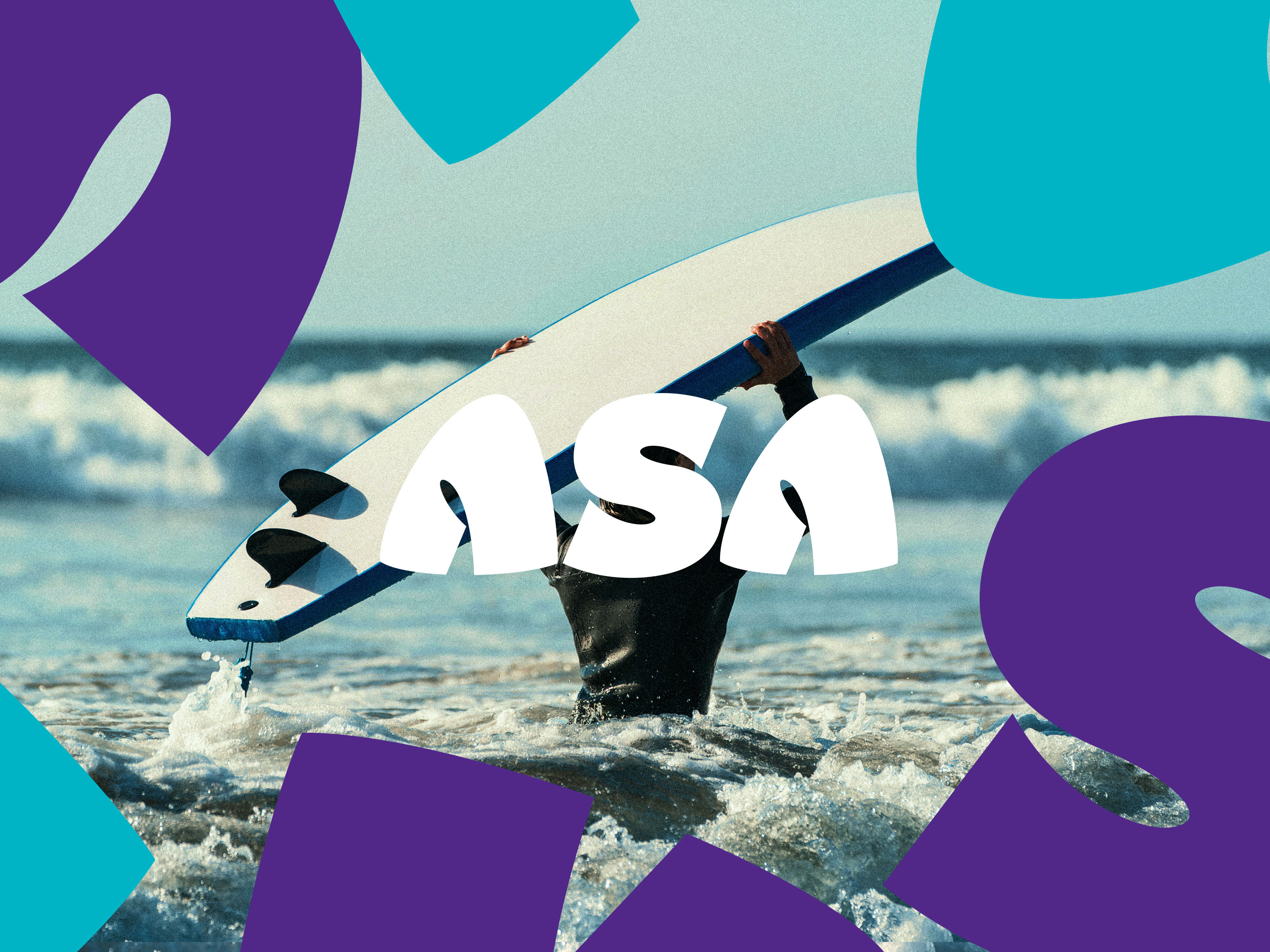
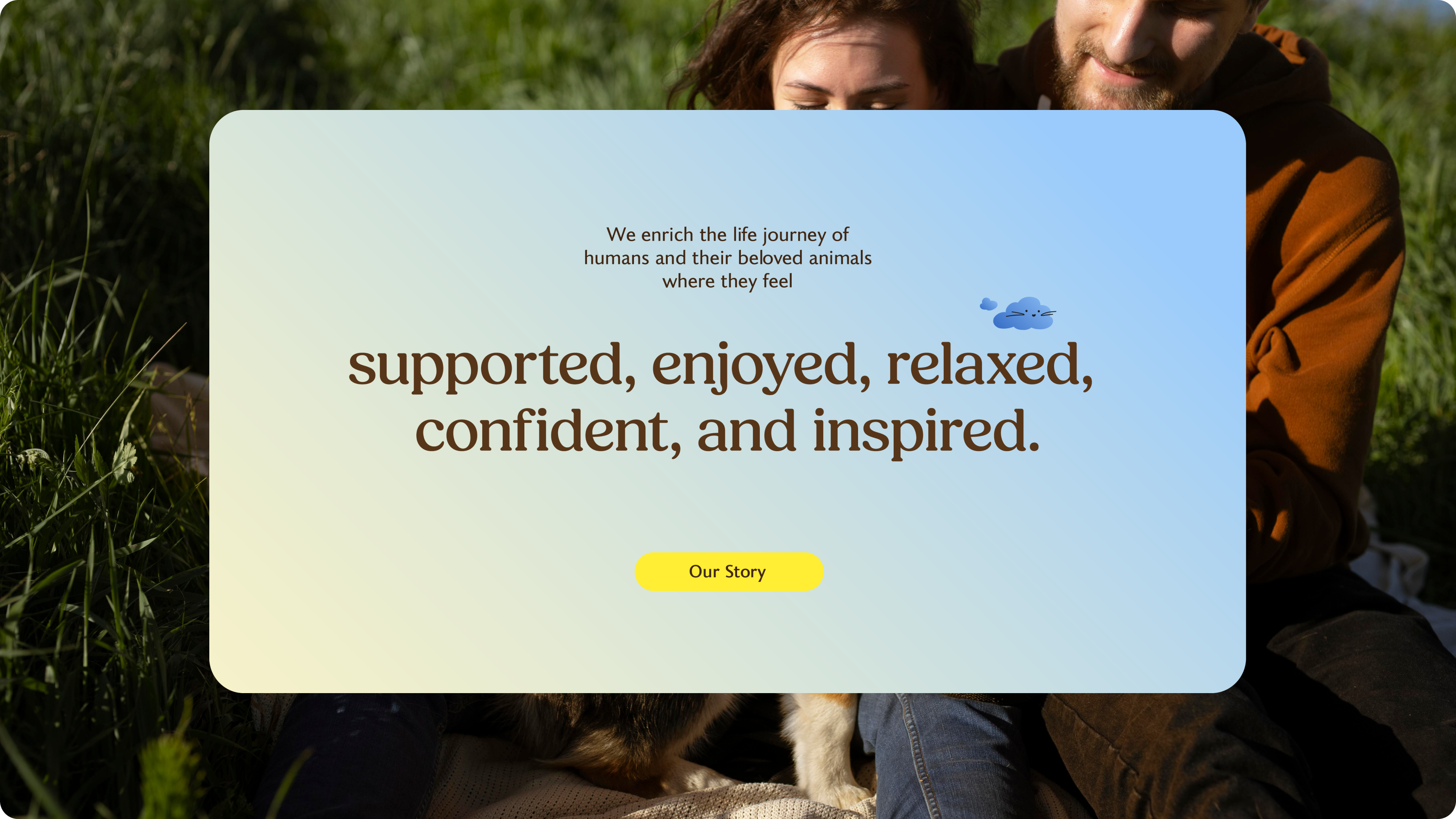
YMOAs is a startup founded by three Chinese pet lovers, based in the Netherlands. Being away from home, pets mean more to them than family members. These young people are dedicated to providing the best for their pets and encouraging like-minded pet owners to join them by offering curated pet supplies, products and knowledge. Their mission is to enrich the lifestyle of both pets and their owners, so they feel confident, supported and relaxed in their pet-caring journey.
Joining their venture at the very beginning, I developed a brand strategy and a comprehensive visual identity that captures their love for animals and the joyful experience they aim to deliver to their audience.
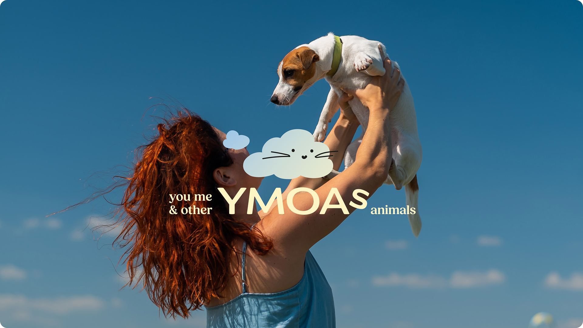
Concept
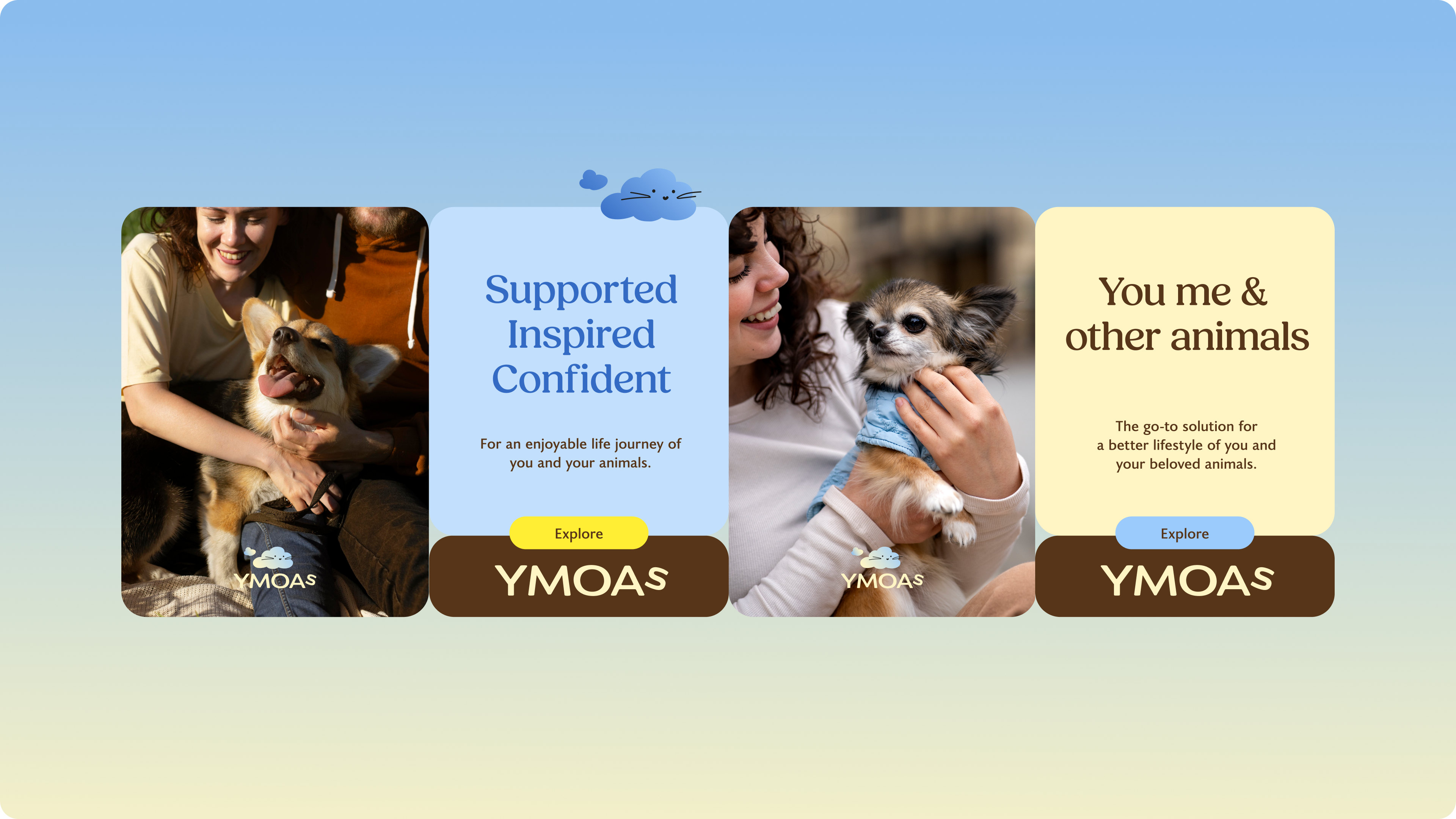
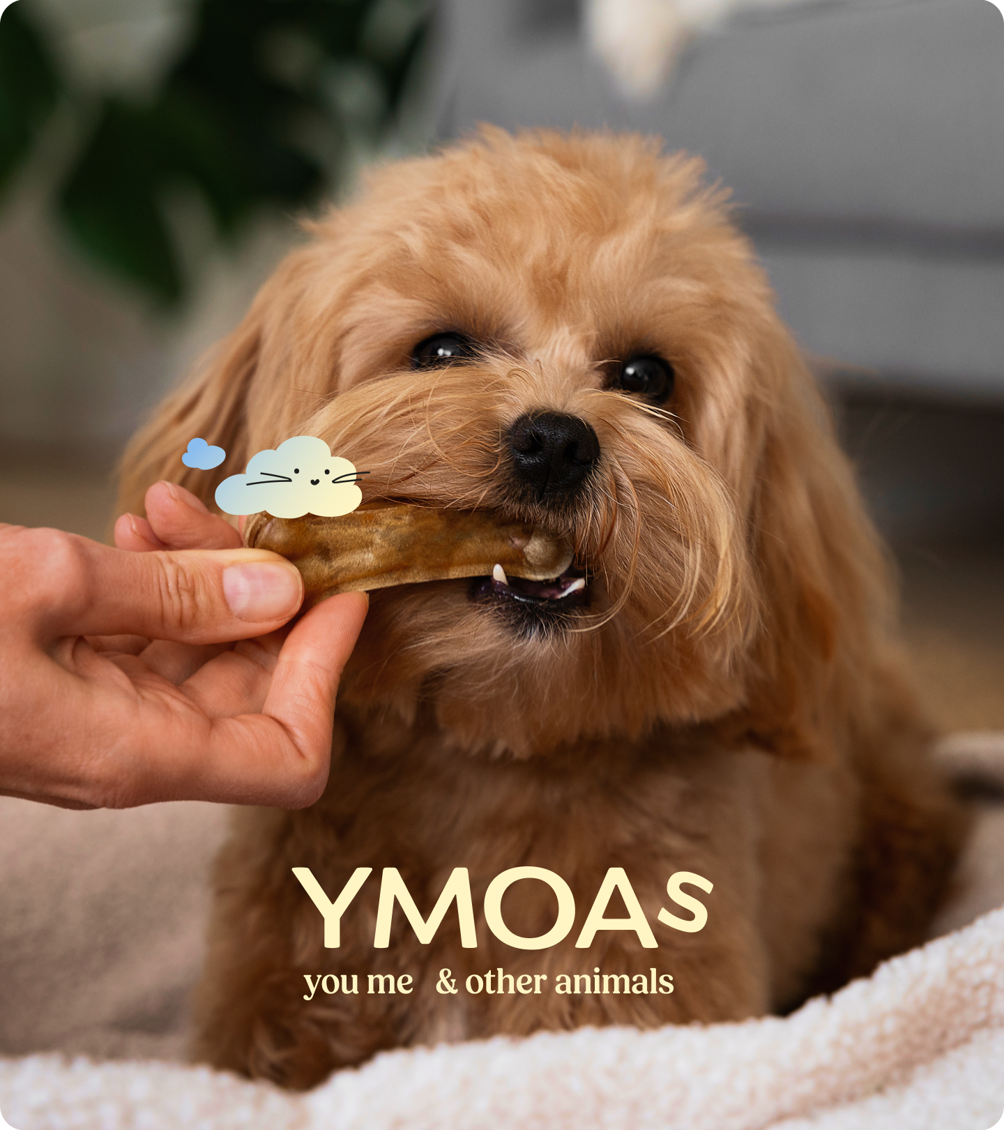
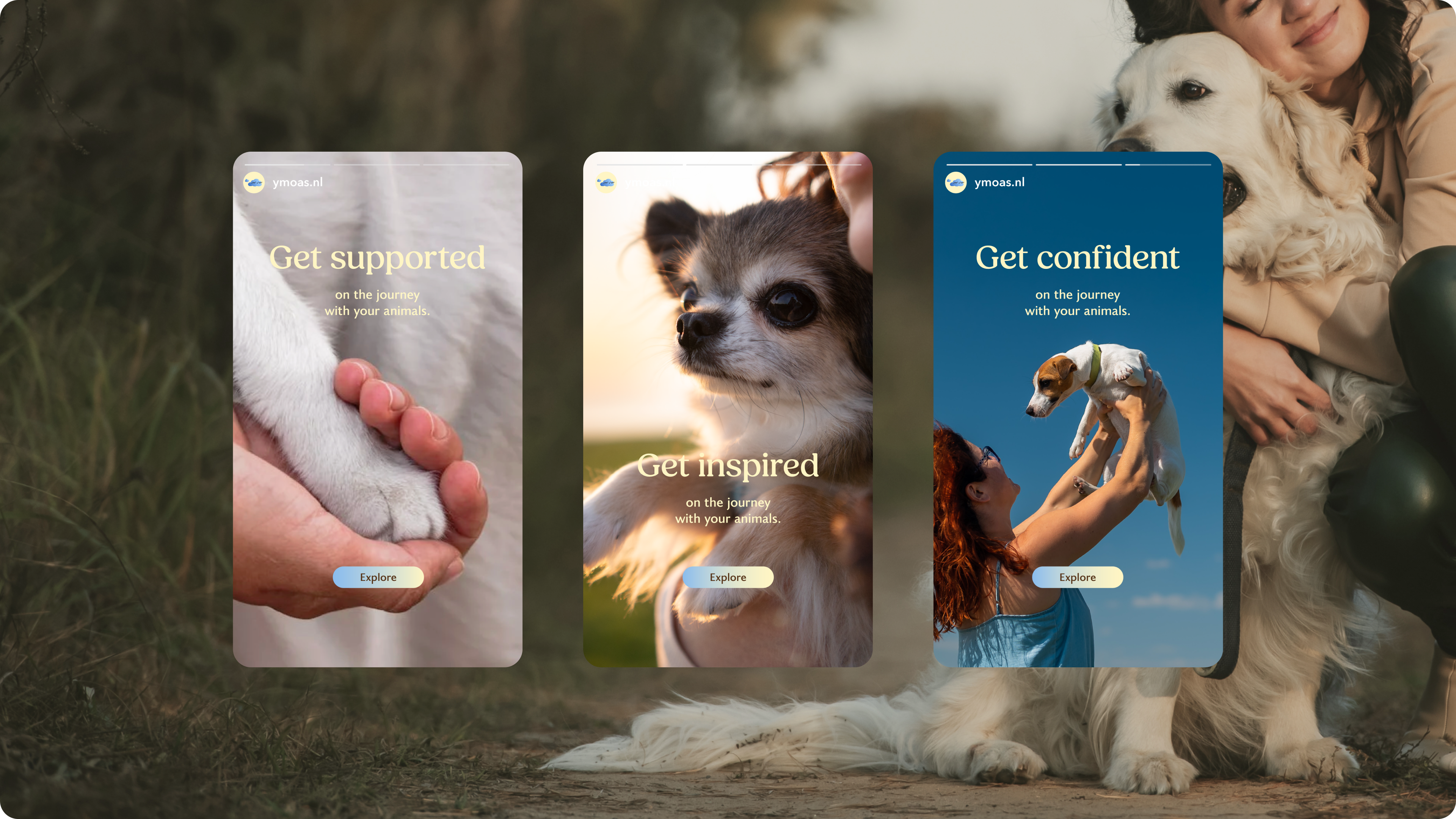
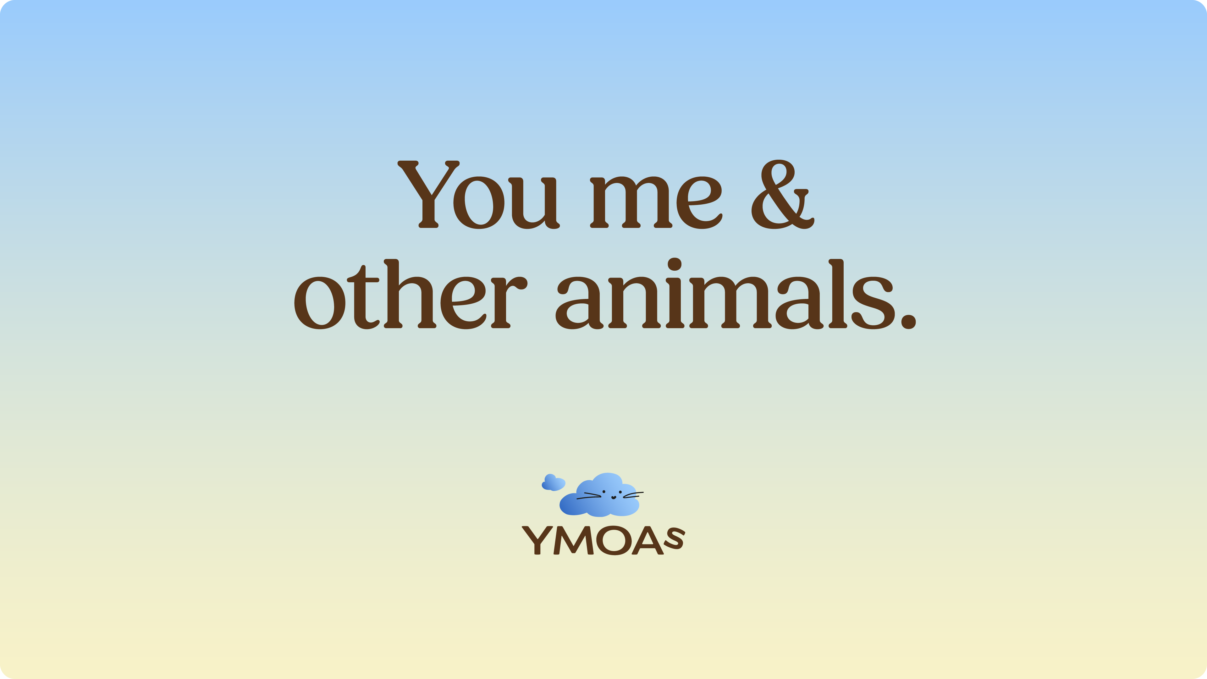
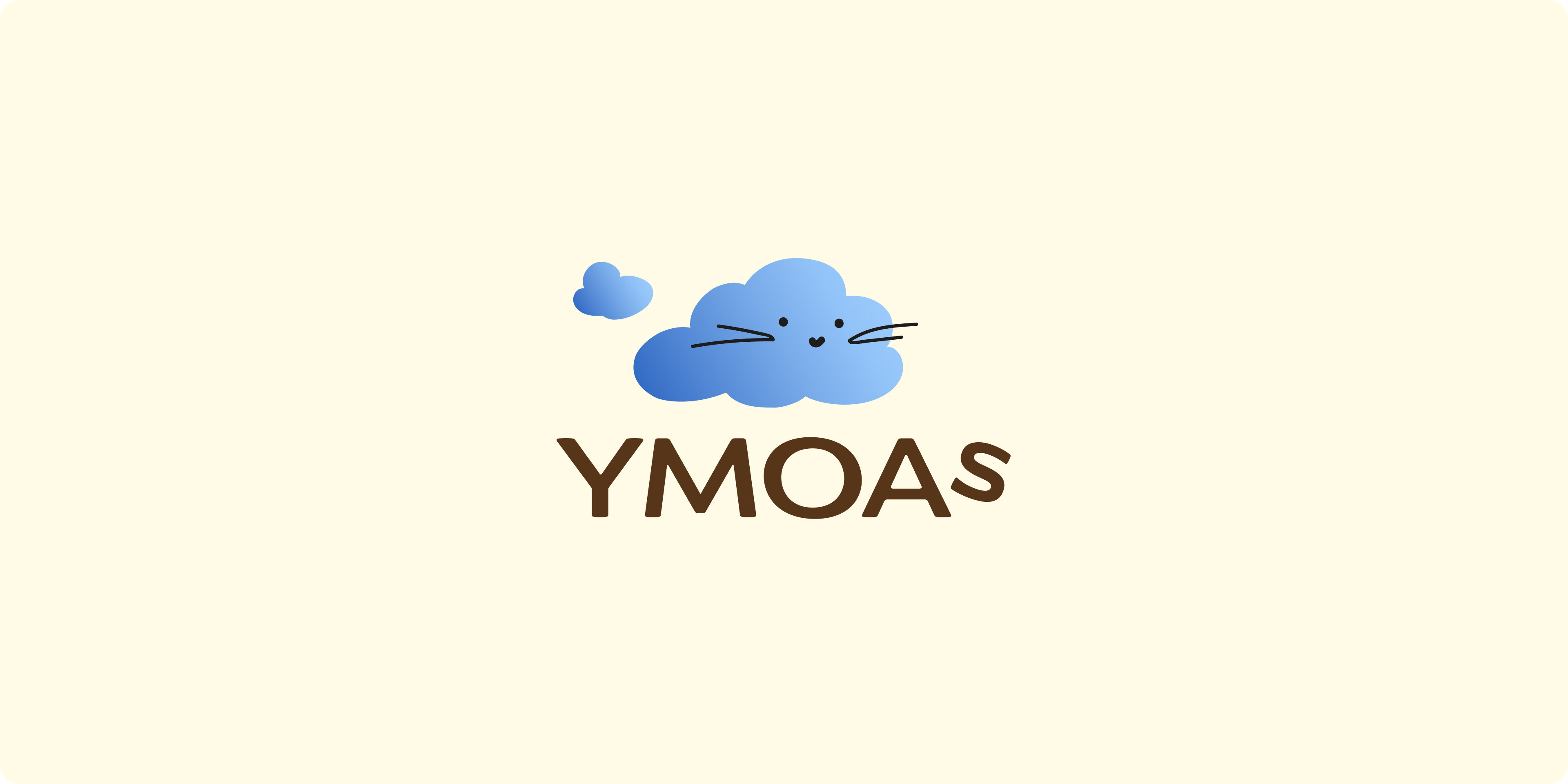
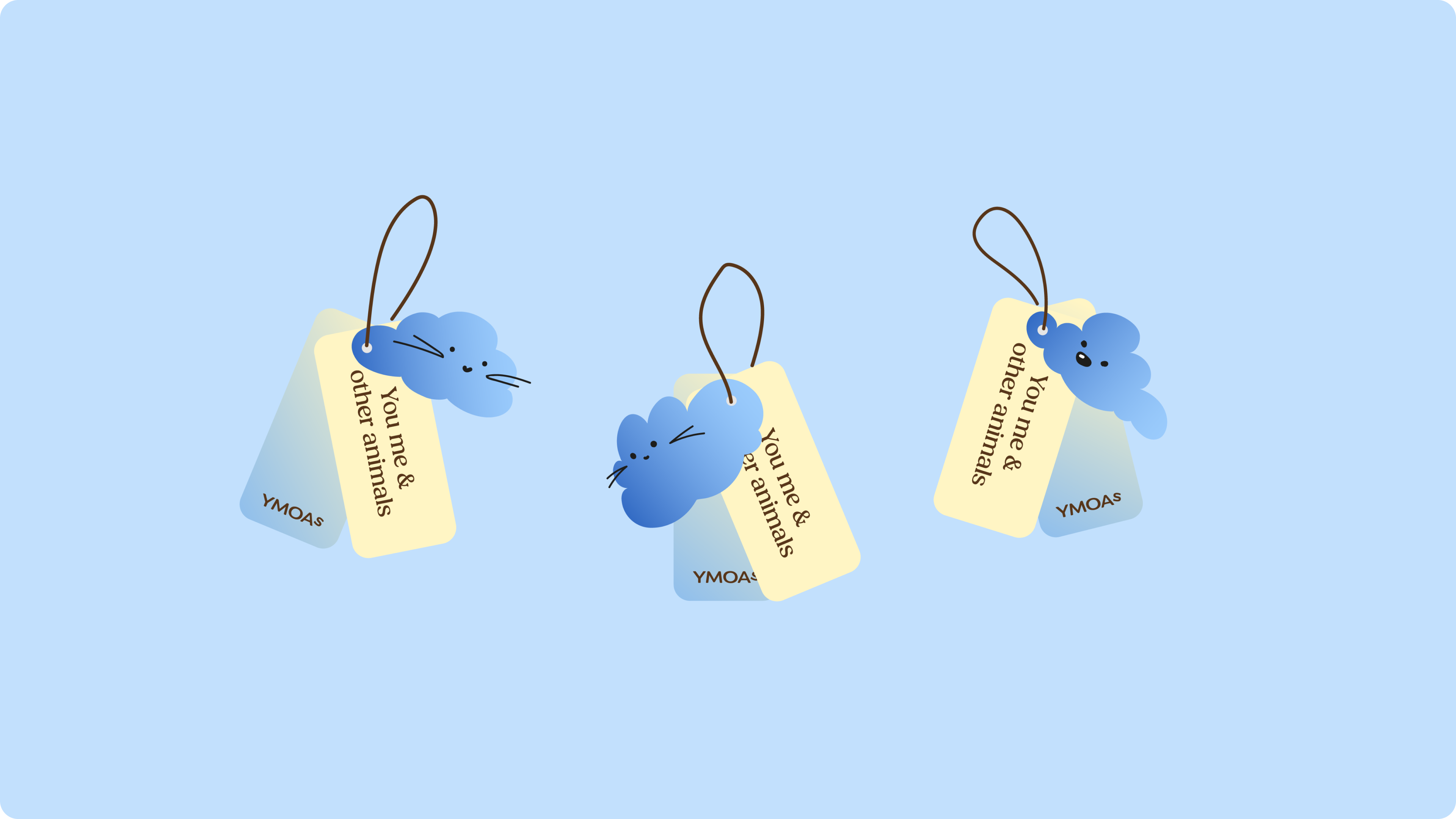
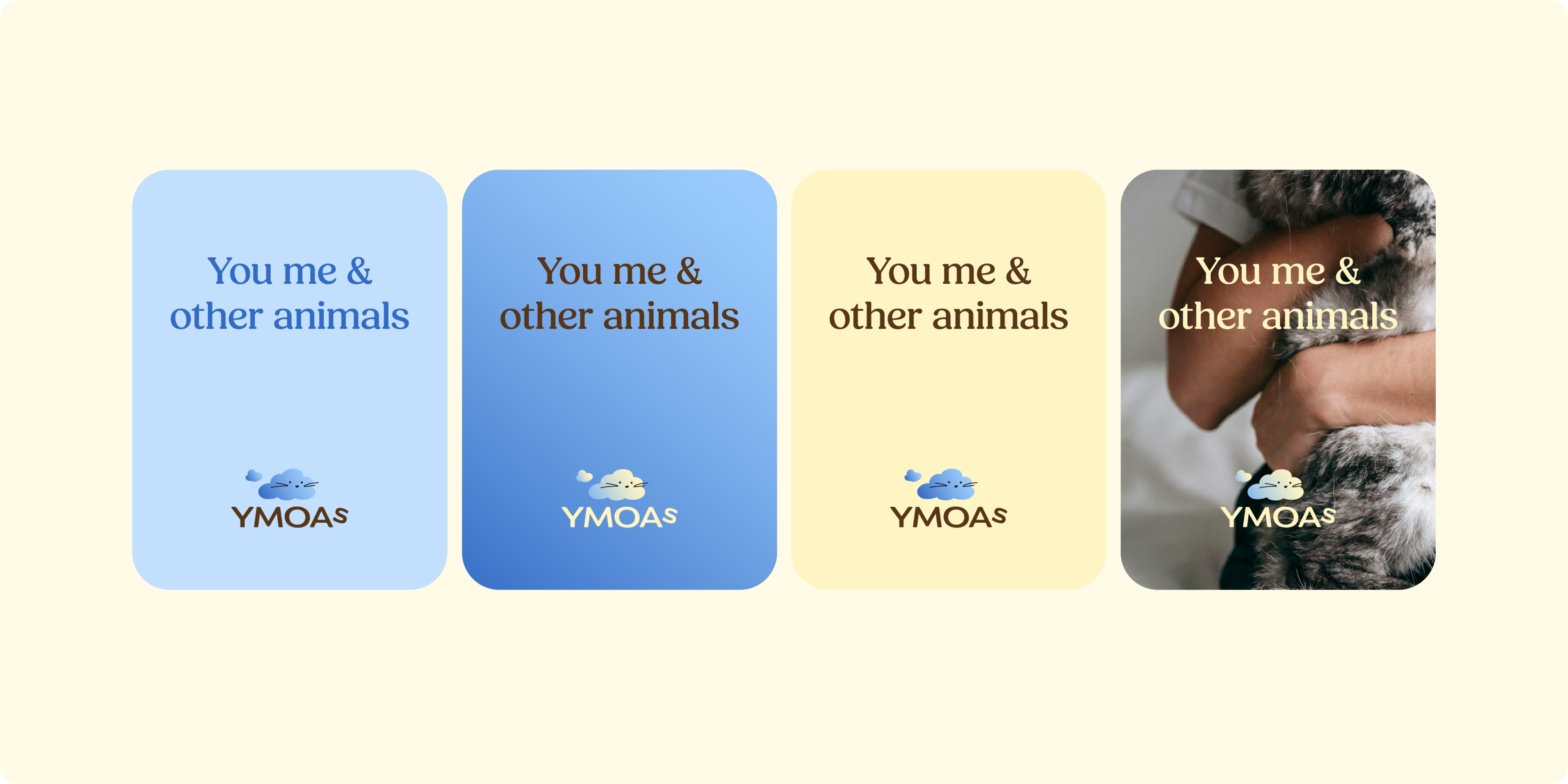
The Cloud Pet symbol was inspired by the calming mood of watching clouds in nature. Associating the soft, fluffy, and ever-changing forms of clouds with various pets, and combining them with subtle animal facial features, we created the logo and the Cloud Family set that stands apart from conventional animal marks. The design reflects the relaxing experience that YMOAs aims to bring to pets and owners, while making the marks distinctive and memorable on products and labels.


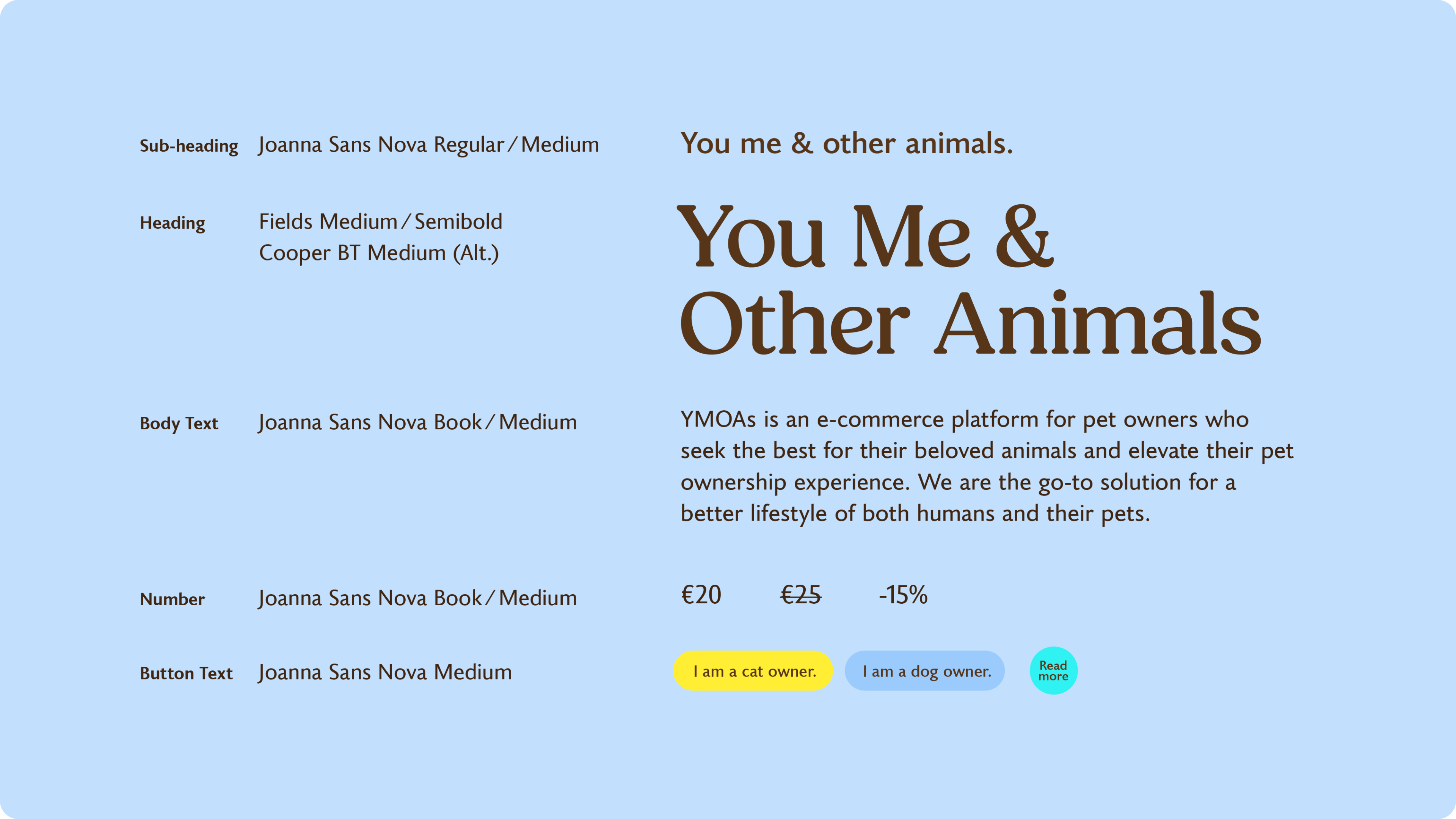
Color and Typography
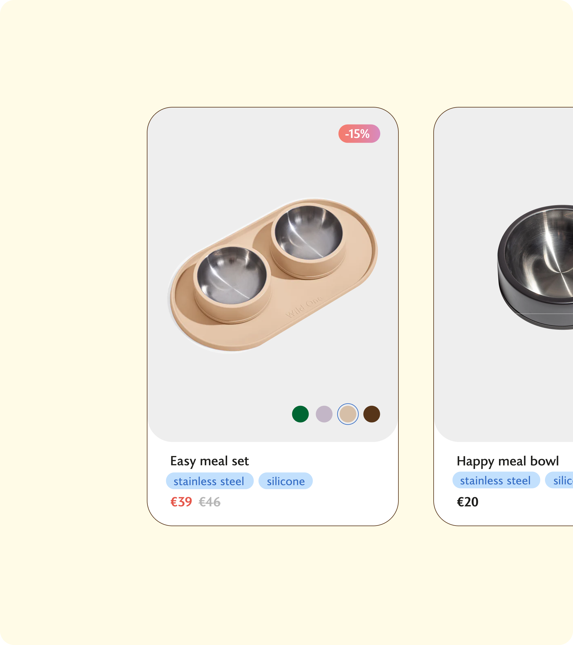
The palette consists mainly of blue and yellow, which dogs can see, and incorporates soft gradients to bring the warmth, diversity and innovation of YMOAs. Paired with Fields for headlines and Joanna Sans Nova for body text with a humanist touch, the visual identity reflects YMOAs’s friendliness, thoughtful care for animals, and commitment to creating a better lifestyle for both pets and their owners by offering products and knowledge.
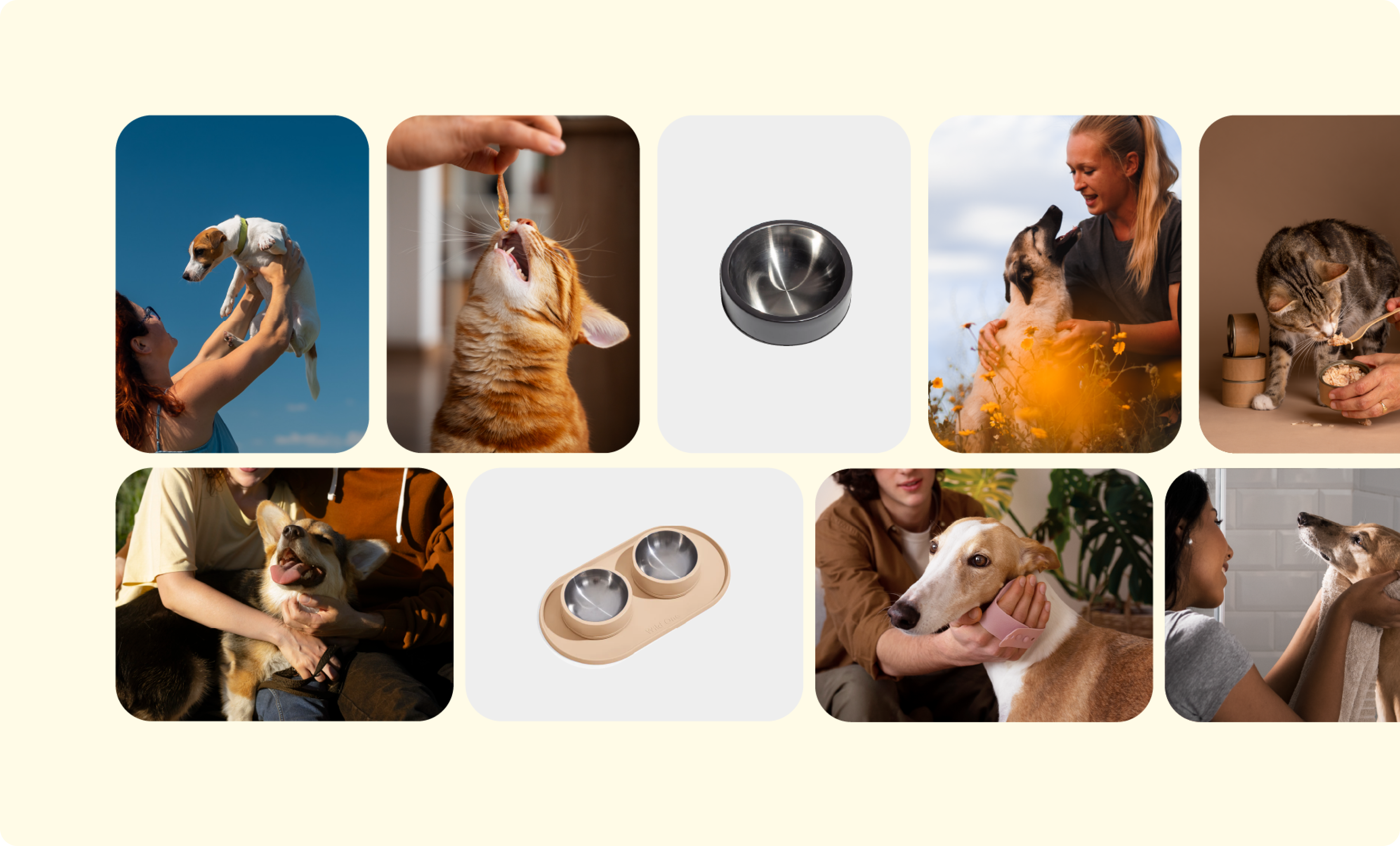
Imagery
The love for pets is the cornerstone of YMOAs, which we translated into a visual photography style that highlights beautiful interactions between humans and their pets, with pets always at the centre of the narrative.